Quara & Wasalt
Two 0→1 launches for Saudi Arabia's Quara Holding
Hired for a 10-day heuristic evaluation, I looked at the designs the client had shown me and assumed they were wireframes — they weren't. Within thirty minutes I'd convinced the account manager to scrap the evaluation and let me lead a redesign instead. Six to twelve months later, both products were live: a Sharia-compliant lending platform with Klarna-style retail integration, and a national property marketplace in English and Arabic.

The shape of the work.
- Quara Holding · Riyadh
- Investment firm, multi-sector ecosystem
- Real estate · tech · financial services
- Quara Finance · Sharia-compliant lending
- Wasalt · national property marketplace
- Two parallel 0→1 launches
- Lead Product Designer
- Solo IC → leading 4 designers
- Across both products
- External consultancy
- Remote from Europe
- 6 to 12 months end-to-end
The good bits
are behind a door.
Most of this work lives under NDA — clients, internal screens, the numbers I shouldn't be shouting about. Drop the password and the rest of Quara & Wasalt unlocks. (One password, all projects, this session.)
Thirty minutes to a different brief.
Quara Holding had commissioned my consultancy for a 10-day heuristic evaluation of Quara Finance. The brief was straightforward: review the designs, document the issues, deliver a report.
The client showed me the designs and I started reviewing. Within thirty minutes I realised something was off. The work I was looking at had fundamental visual design problems — broken hierarchy, inconsistent components, typography and spacing that left key information almost unreadable. The screens were so far from production quality that I'd been assuming they were wireframes. They weren't. They were the actual designs the client was preparing to build.
I went to the account manager with a proposal: scrap the evaluation report. In the time it would take to document everything that was wrong, I could redesign the core templates and give the project something to actually move forward on. He agreed.
Designing for Sharia-compliant credit.
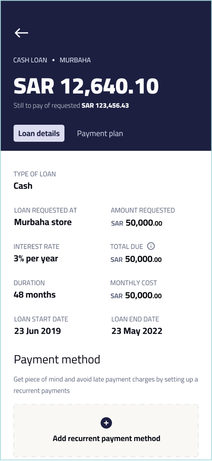
Quara Finance is a Sharia-compliant lending platform. That constraint shaped every part of the design work. Sharia financing prohibits riba — interest as conventionally structured in Western finance — and requires lending to be structured around profit-sharing, asset-backed transactions, or fee-based models that comply with Islamic law. Loan terms, repayment schedules, and the language used to describe the relationship between lender and borrower all have to be carefully constructed to remain compliant. Transparency requirements are different. The vocabulary of consumer credit that designers in Western markets reach for unconsciously — APR, interest rate, finance charge — doesn't apply.
The product covered two distinct lending experiences:
- Direct cash loans — Users on the app or web request a specific loan amount, and the platform handles approval and disbursement.
- Point-of-sale retail lending — A Klarna-style experience embedded in partner e-commerce checkouts and physical store payment flows, allowing customers to finance a specific purchase at the point of buying.
The second experience was the more interesting design problem. It wasn't enough to design "an app" — the lending experience had to work inside other people's products (partner e-commerce sites) and at physical store checkouts. Each surface had different constraints. The visual language had to flex. The trust signals had to land in seconds.
The engagement didn't allow time for direct user research with Saudi consumers. I worked from a jobs-to-be-done framing instead — anchored on what the client knew about how their customers used existing credit products, what the partner retailers needed, and what the regulatory environment required.
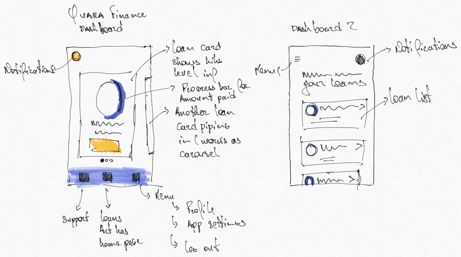
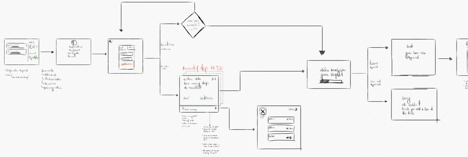
The first work wasn't screens, it was the shape of screens. Hand sketches of the dashboard concepts and a flow diagram for the loan request journey that mapped every state, every decision point, every recovery path before any UI committed to a layout.
This is the part of the work that's easy to skip. With a stakeholder pushing for momentum and a junior designer eager for direction, the temptation is to jump straight to high-fidelity. The discipline at senior levels is doing the rough work first anyway — because every shortcut taken at this stage compounds into rework later.
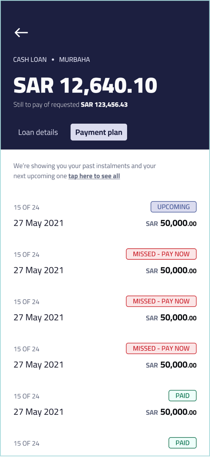
The dashboard had to do a lot of work with a single component. A user's relationship with a loan changes over its lifetime — from the optimism of a brand-new loan ("0 of 24 instalments paid"), through the routine of healthy mid-progress ("15 of 24, next payment due"), to the urgency of a missed payment that needs immediate action.
The same component had to absorb all three contexts without becoming three different screens. The progress ring shifts from neutral blue to confident green to alert red. The header band appears, expands, or stays hidden depending on whether a payment is upcoming, due, or overdue. The primary action surfaces only when there's something the user needs to do now.
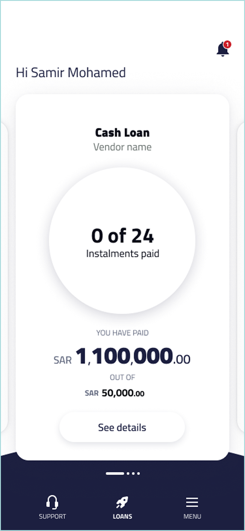
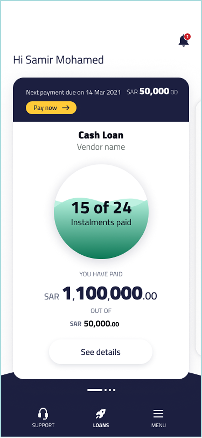
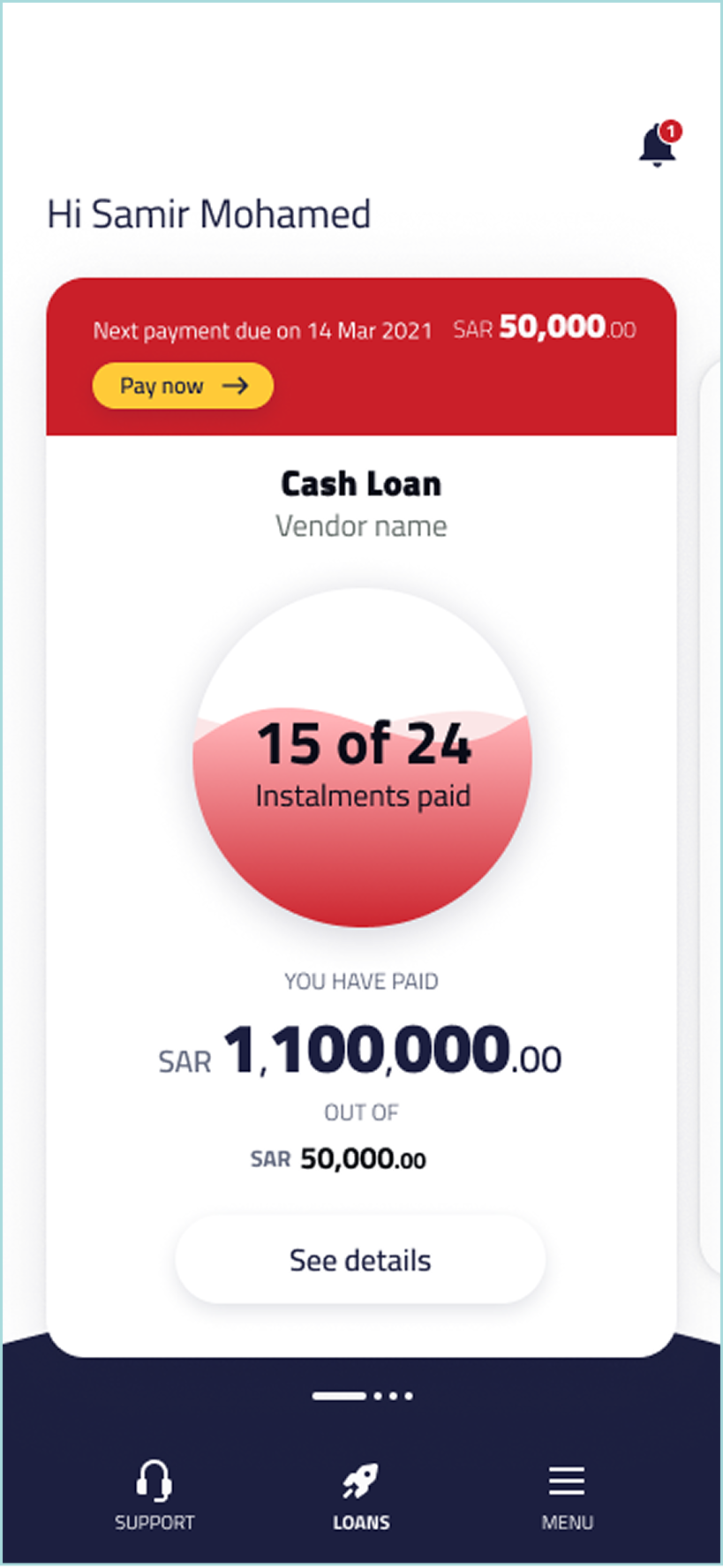
Behind the home screen sat the deeper layer — the detail view for a specific loan (type, amount requested, profit rate, duration, monthly cost, start and end dates, payment method setup) and the payment plan view, which laid out every past, current, and upcoming instalment in a single scrollable timeline with status pills (Upcoming, Missed — Pay Now, Paid).
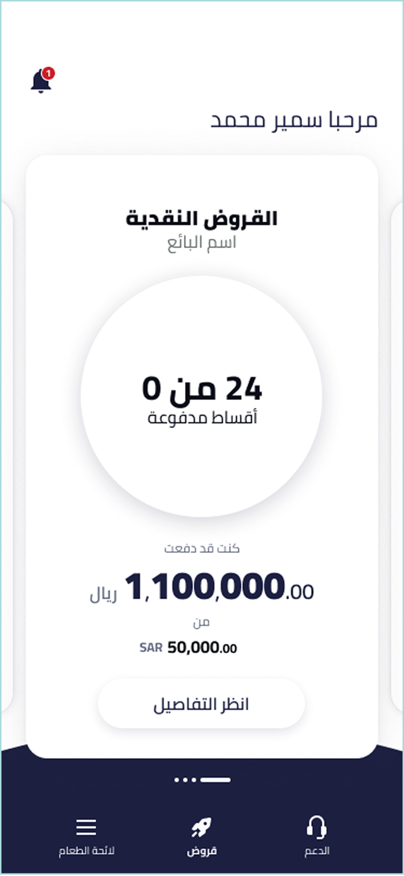
This is where the Sharia-compliance language work mattered most. Field labels, terminology, the framing of charges and obligations — every label had to read correctly in a regulatory context that doesn't map to Western credit conventions.
Mentoring craft, arguing for the work.
For the first four to six weeks I worked solo on Quara Finance, producing the new design foundations: the core templates, the visual system, the patterns that the rest of the app would be built from.
When the workload outgrew what one person could deliver, I requested a second designer. A junior designer joined — strong on UI craft, early in her career, ready to learn. From that point on, a significant part of my work on Quara Finance was mentorship.
Alongside the mentorship sat a different kind of work. The top stakeholder at Quara Holding was an unusual presence in the engagement. Very senior, very opinionated, and very willing to direct design decisions himself.
I made a different choice. Every significant design decision came with a rationale: why this layout, why this pattern, why the alternative he was proposing would create problems we'd both regret later. I lost some battles. I won most of them. More importantly, the disagreements stayed productive.
What I didn't know at the time was that he was watching how I handled him. That mattered later.
The pivot was the relationship.
Around month two of the engagement, I learned there was a separate team working on Wasalt — a national property marketplace running parallel to Quara Finance, with its own design team. I had nothing to do with it.
A month later, that changed. The same stakeholder who'd been the top voice on Quara Finance requested me specifically for Wasalt. Not because of my visual design work. Not because of the mentorship. Because I'd shown I could disagree with him and keep him in the room.
I moved over. The junior designer moved with me. Quara Finance was handed cleanly to another designer who took it through to completion.
Wasalt was significantly behind schedule when I joined. The previous design work had followed the client's direction closely — perhaps too closely. With a stakeholder this opinionated, executing the brief literally meant building the wrong product, slowly.
The previous designer wasn't incompetent. They'd done what was asked. The lesson buried in that — and one I've returned to often since — is that doing what stakeholders ask isn't the senior move. Knowing when to refuse to is.
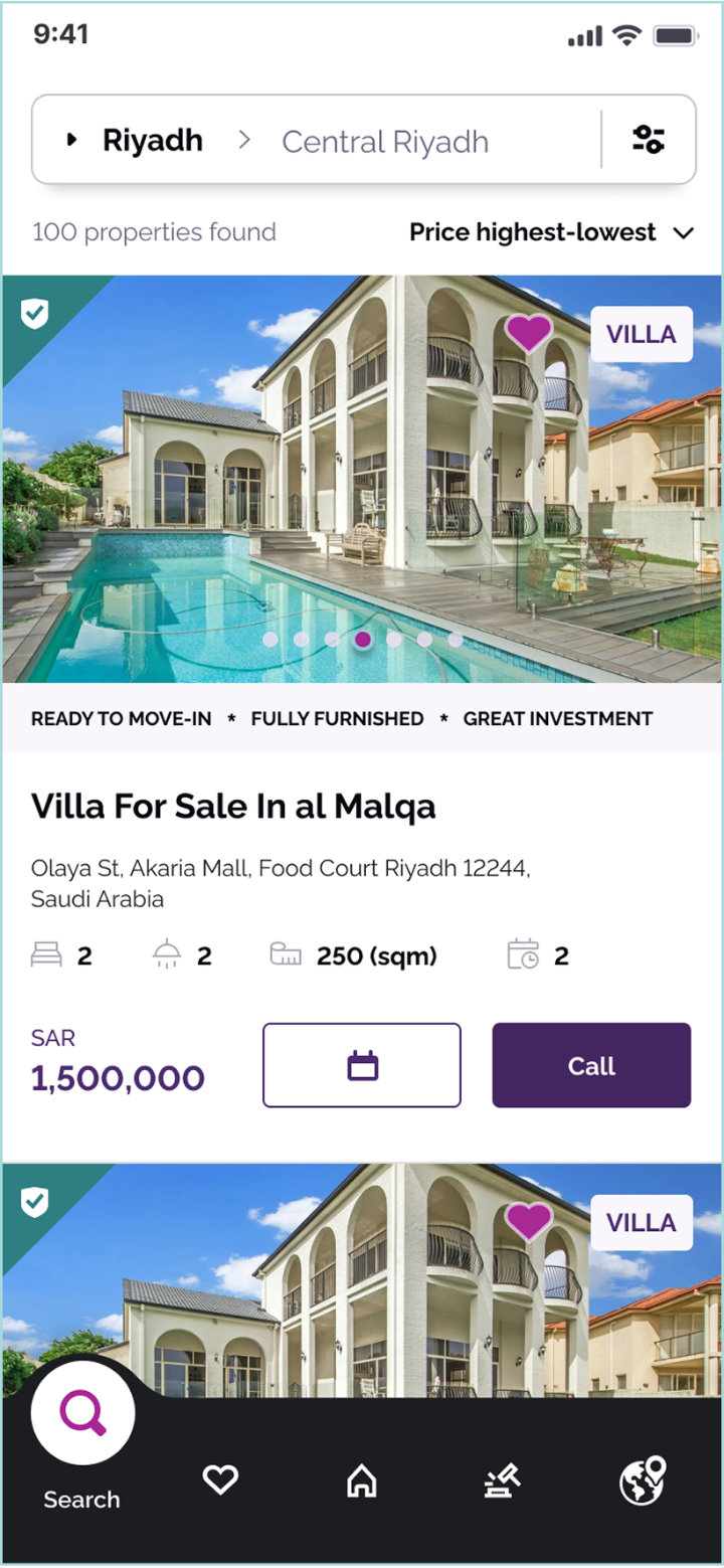
Two transaction models, one product.
Wasalt is a national property marketplace serving buyers, sellers, and agents across Saudi Arabia. What made it interesting as a design problem was that it shipped with two distinct transaction models running side by side.
- A traditional marketplace — in the Zillow or Rightmove pattern. Users browse listings, find properties they're interested in, and are connected to agents.
- An in-app auction platform — users find a property, bid through a structured auction flow, and complete the entire transaction in-app, end to end.
The auction model was the unusual one. Saudi Arabia's property market has historically been relationship-driven and offline. Designing an in-app auction that customers would trust enough to commit real money to — for a major purchase — was a meaningfully different design problem from the marketplace. It required careful work on signalling: unambiguous bid status, transparent rules, recoverability from mistakes, time-pressure framing that didn't tip into anxiety, and trust signals that worked credibly in both English and Arabic. We treated the auction as a separate behavioural design problem layered on top of the marketplace — different mental model, different risk profile, different language of confirmation and commitment.
The marketplace itself had to feel native to how people actually look for property: starting on a map, narrowing by filters, browsing a list of matches, and dropping into a detail view for the one that catches their attention. Every entry point connected back to the others, so a user could move between map, filters, list, and listing without losing their place or their criteria.
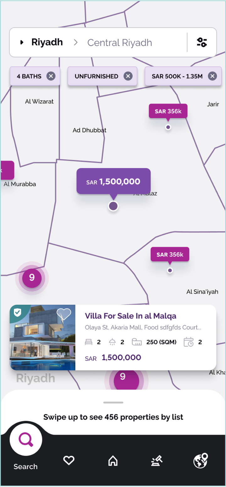
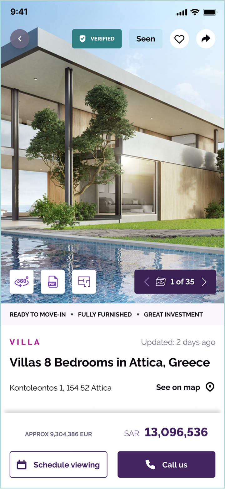
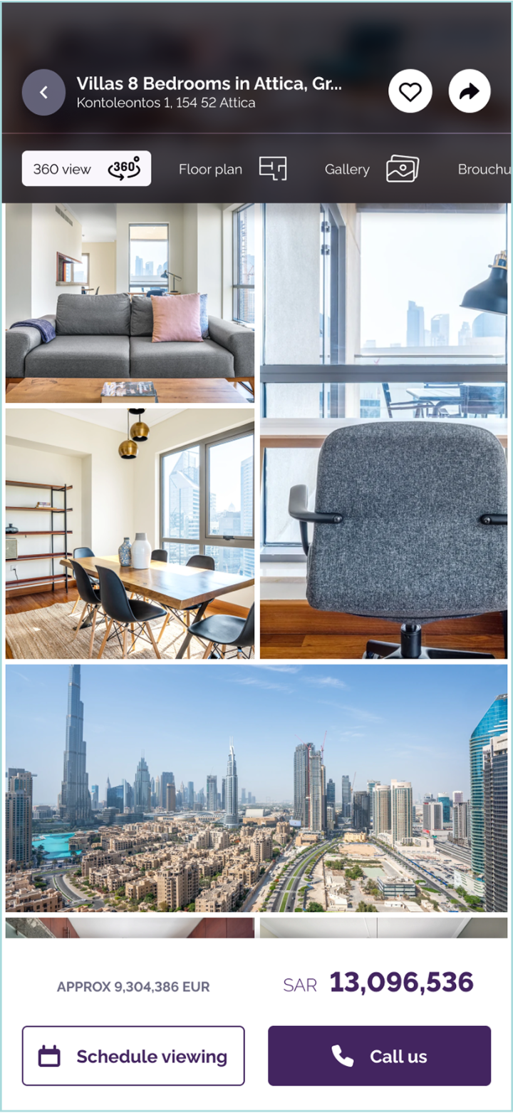
The listing detail page was a separate craft problem in its own right. A property is bought on emotion as much as fact, and the gallery had to support that: high-fidelity imagery, a 360° view affordance, floor plan and brochure entry points, and an image-grid mode for fast scanning alongside a single-photo mode for slowing down on the rooms that mattered.
Velocity is a senior tool.
The brief was simple: get Wasalt back on schedule. Time pressure meant we couldn't run formal usability testing. I had to find another way to keep the work grounded.
The answer was velocity. I established a daily delivery cadence with the senior stakeholder: every day, something new was presented — sketches, mid-fidelity flows, high-fidelity screens, prototypes. The deliberate design of this rhythm was that the iteration cycle became so tight that course-correction happened in hours, not weeks.
The cadence did three things at once:
- It absorbed the stakeholder's energy productively. A stakeholder who wants to direct design will direct it more constructively when they can see the work moving every day.
- It kept the team honest. Daily deliverables left no room to over-polish. We shipped enough to discuss and moved on.
- It bought back the schedule. Two weeks into the cadence, the project was visibly moving again. Within a month, it was tracking to dates everyone believed in.
About three to four weeks into the Wasalt work, the design team expanded. The final shape was four designers across the engagement: two on the app and two on the responsive web build, working from the same foundations.
Two functioning versions of every screen.
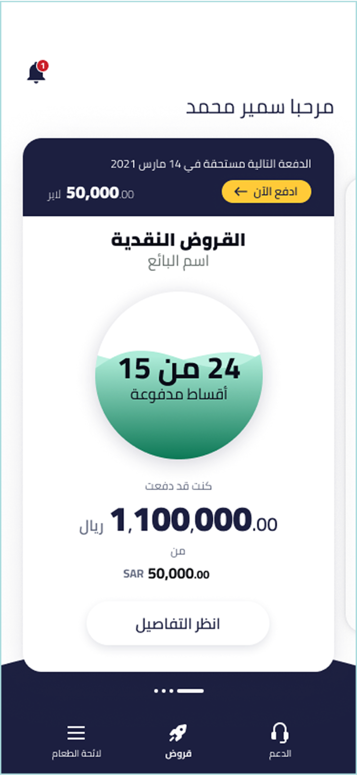
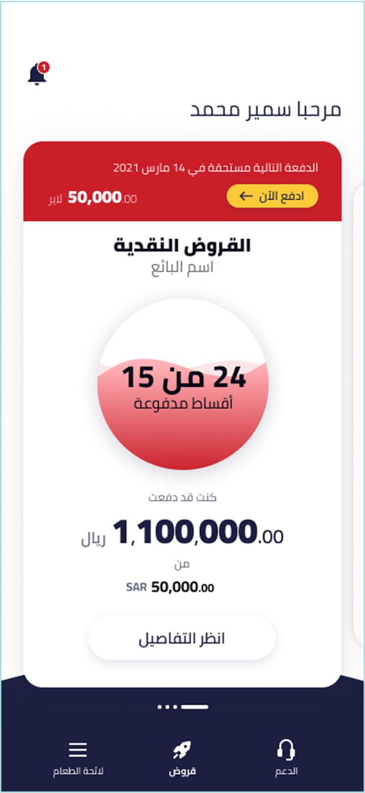
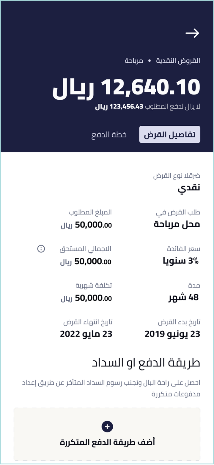
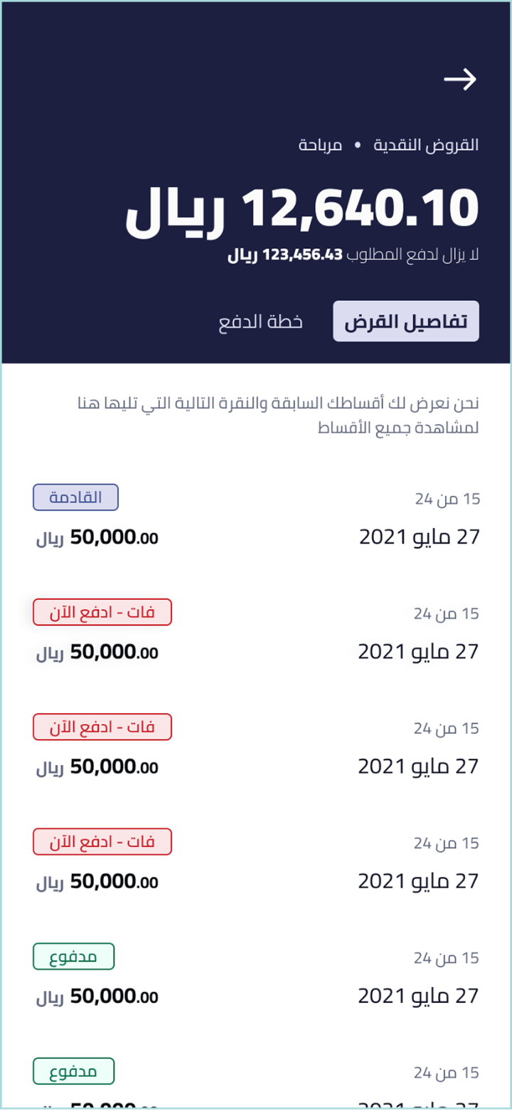
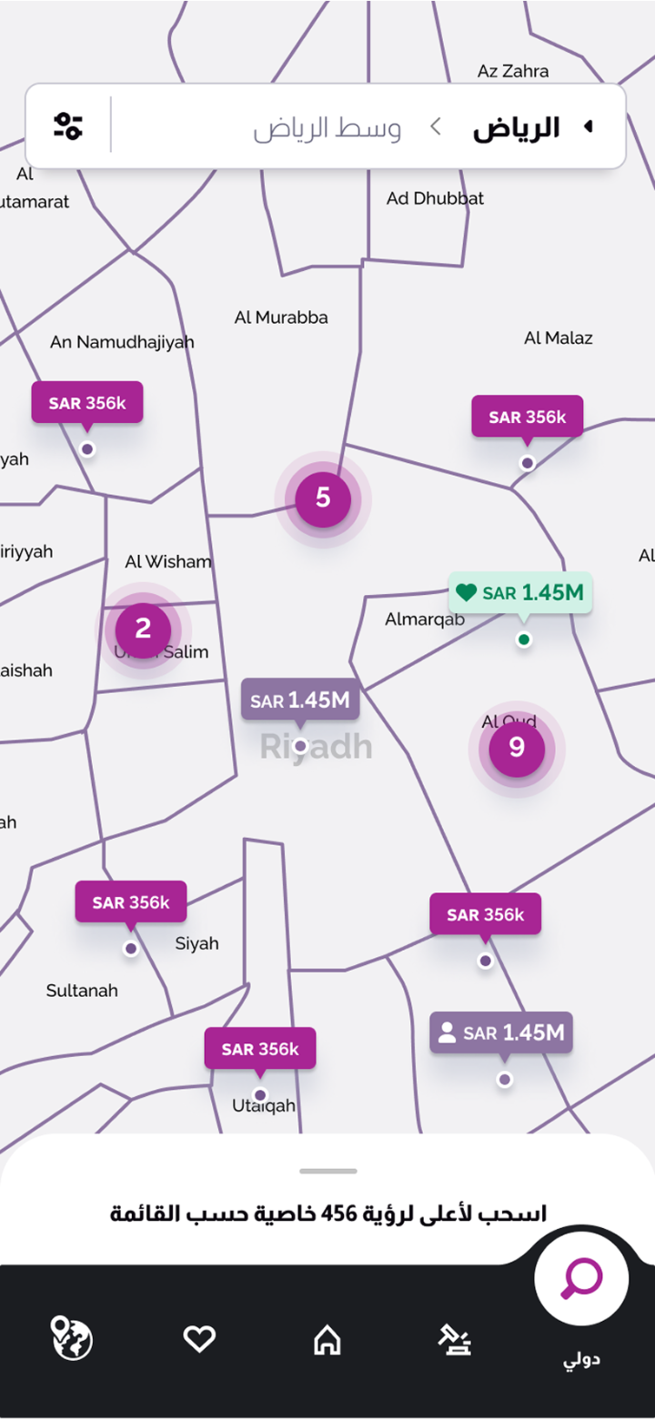
This wasn't a Wasalt-only discipline. Both products shipped in English and Arabic, and the RTL work ran in parallel with the LTR work from the start. It was not a translation pass. It was a parallel design discipline.
Arabic is a right-to-left language, which means every layout decision — navigation direction, iconography orientation, form field flow, scroll behaviour, even where the primary CTA sits relative to secondary actions — has to work in both directions.
The discipline this enforced — designing two functioning versions of every screen rather than designing one and translating — became one of the most useful skills I took out of the engagement.
Three lessons used in every engagement since.
Quara taught me three things I've used in every engagement since.
The brief you're given is not always the brief you should do. I was hired for ten days of analysis. The first thirty minutes told me a different brief would serve the client better.
Stakeholder management is design work. The reason I ended up leading Wasalt wasn't my craft. It was how I handled a demanding stakeholder on the project before.
Velocity is a senior tool. When a project is late and testing is off the table, accelerating the cadence — daily, not weekly — collapses risk in ways most teams don't try because it looks scary. It isn't. It's the closest thing to a guarantee that a difficult project will land on time.
What it moved.
See them in the wild.
Sharia-compliant lending — direct cash loans + Klarna-style retail POS, regulated by the Saudi Central Bank.
National property marketplace — bilingual EN/AR, map + filter search, agent handoff.
In-app property auction — structured bidding, end-to-end transaction without leaving the app.
Other work.
Let's
talk.
Curious how I can support you and your team? I'd love to hear what you're working on.