Lloyd's Register
How nine weeks of design strategy saved a £10M engagement
After a previous agency had been paid £2M and delivered work the client couldn't trust, Lloyd's Register needed proof before committing to anyone again. I led a 9-week design strategy sprint that converted a burned client into a £1.5M fixed-price contract — and a projected £10M+ engagement over five years.

The shape of the work.
- Lloyd's Register
- World's oldest marine classification company
- Engaged via BAE Systems
- Class Direct · marine certification platform
- Internal tool + external customer app
- Surveyors · ops teams · shipowners
- ~2 years across three phases
- 9-week strategy sprint + 2 builds
- Leeds + Kuala Lumpur · ~50 devs
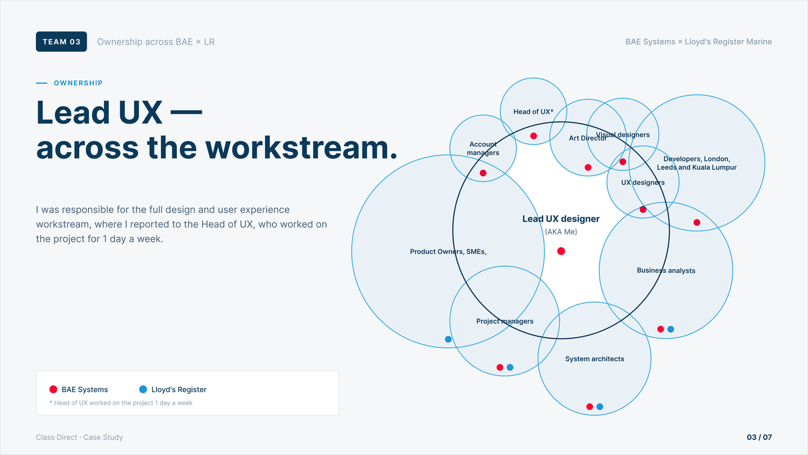
- Lead UX Designer · growing scope
- End-to-end ownership · Phase 2
- Direct client stakeholder management
The good bits
are behind a door.
Most of this work lives under NDA — clients, internal screens, the numbers I shouldn't be shouting about. Drop the password and the rest of Lloyd's Register unlocks. (One password, all projects, this session.)
A burned client who needed proof before signing again.
Lloyd's Register is the world's oldest marine classification company. They certify the safety of marine assets globally — from cargo ships to offshore drilling platforms — and their digital tooling, Class Direct, supports the surveyors and operations teams who do that certification work in the field.
By the time I joined, Class Direct was failing and Lloyd's knew it. They had already paid a previous agency £2M to fix it, and the work had not landed. They were not in a hurry to commit another large budget to another large agency before they understood, in detail, what they would actually get and what it would cost.
This wasn't a discovery engagement in the normal UX sense. It was a commercial de-risking exercise. The 9-week strategy sprint had a clear job: produce enough structure, enough evidence, and enough credible direction that BAE Systems could quote Lloyd's Register a fixed price for the redesign without losing money — and that Lloyd's could sign that contract with confidence.
The design strategy was the thing being sold. The redesign was what the strategy unlocked.
Three deliberate steps in scope.
I joined BAE Systems' delivery team as Lead UX Designer on the Lloyd's account. Across the engagement, my role grew in three deliberate steps — each one a conscious widening of responsibility, not a passive expansion.
“Nuno has consistently demonstrated that he is an expert in all areas of the UCD lifecycle, and in particular Information Architecture, Interaction Design and Data Visualisation. He is well-respected by clients, and deserved his reputation at BAE Systems for consistently delivering high-quality work, especially when a solution is needed to a complicated problem in a short space of time.— Sam Medrington · Head of UX, BAE Systems
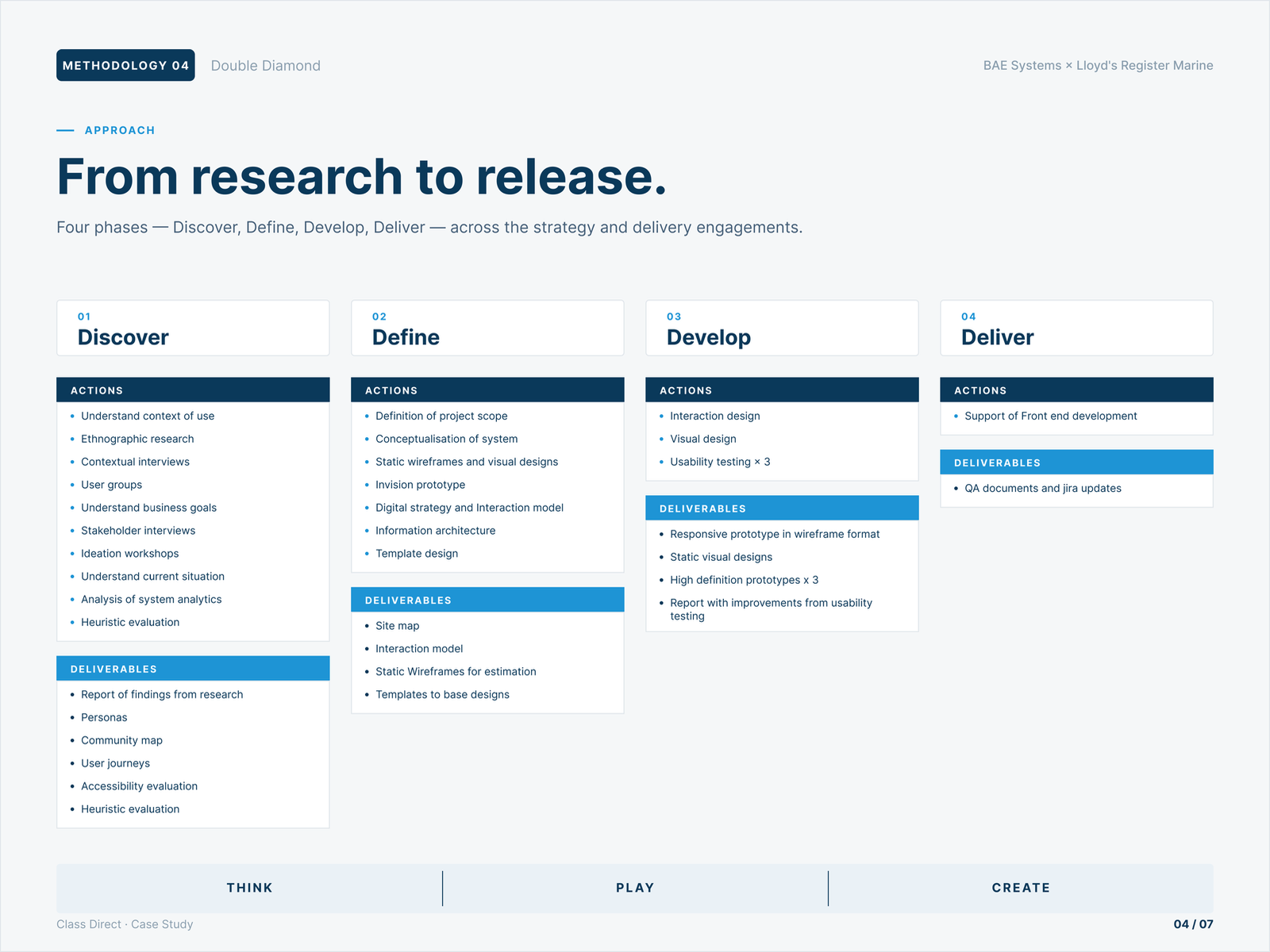
Across all three phases I worked the Double Diamond end to end — Discover, Define, Develop, Deliver. This was the slide that set client expectations and kept the team honest about which deliverables landed in which phase.
Nine weeks to a fixed-price contract.
Nine weeks. One job: produce enough clarity for a fixed-price contract.
The deliverables had to do three things simultaneously — convince Lloyd's that BAE understood the problem, give BAE enough structure to scope and cost the build, and lay foundations the design team could actually use once delivery started. Most discovery work does one of those well. This one had to do all three.
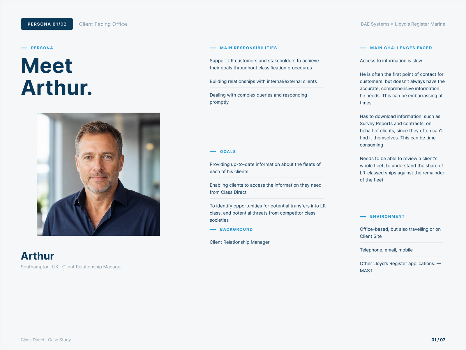
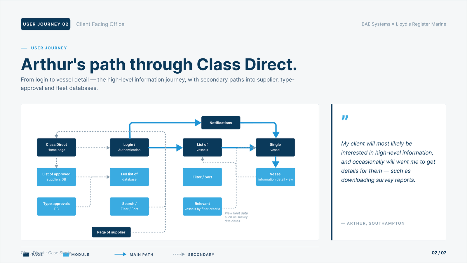
The first move was to ground the work in the people it was for. Lloyd's already had research; we re-built the parts we needed — sharpening the personas around the day-to-day of the Client Facing Office and Surveyor roles, and mapping each persona's path through Class Direct so the team could see, concretely, where the journey broke.
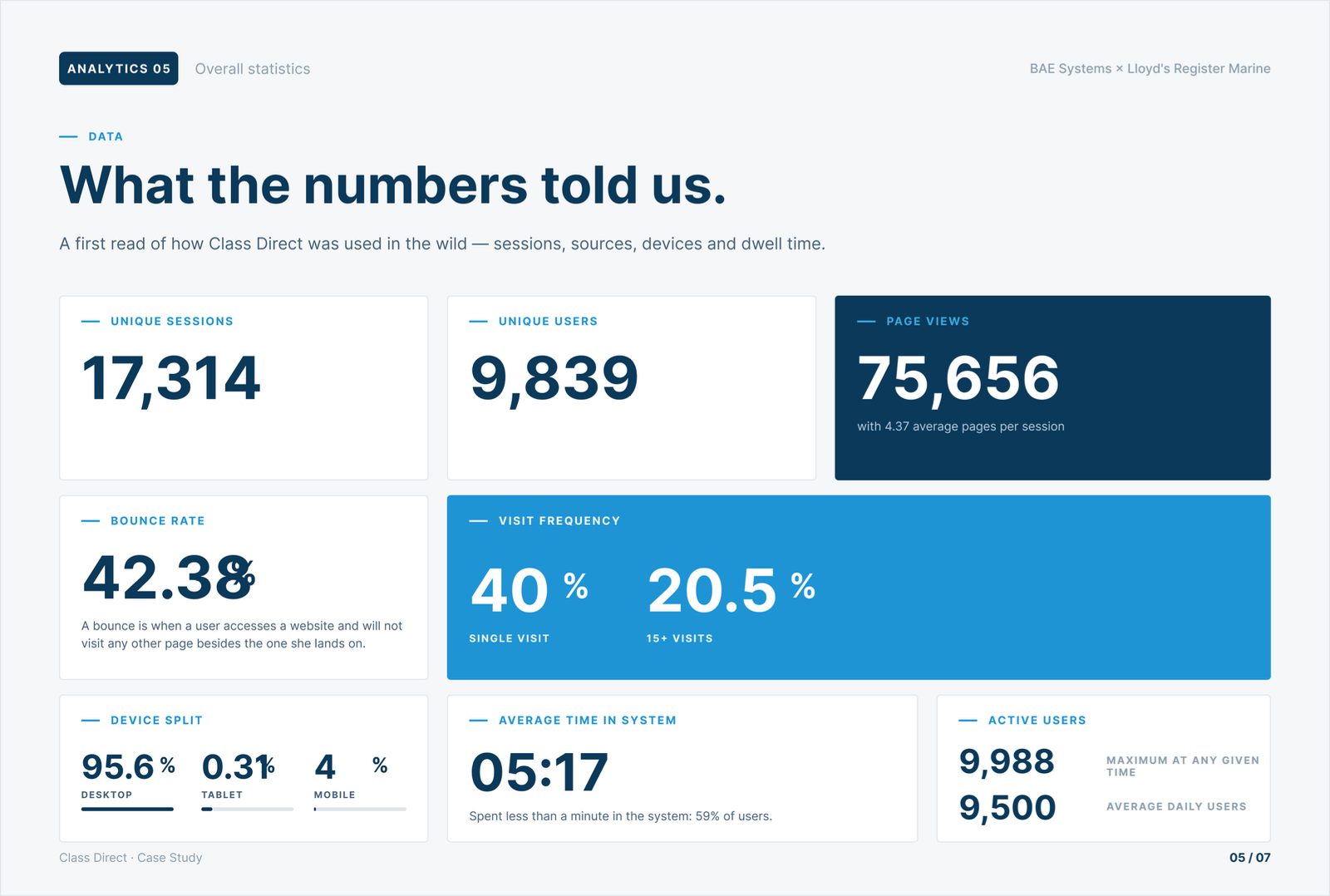
The platform was already heavily used — 9,839 unique users · 17,314 sessions — but the engagement metrics told a different story: a 42% bounce rate, 59% of users spending less than a minute in the system. Users were arriving and giving up.
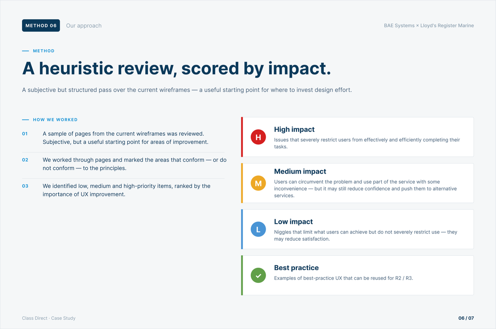
A structured heuristic evaluation and real-world usability testing of the existing platform followed. The results weren't subtle. Navigation was fragmented. User journeys were unintuitive. Key tasks were buried under layers of confusion that even experienced surveyors couldn't navigate without workarounds.
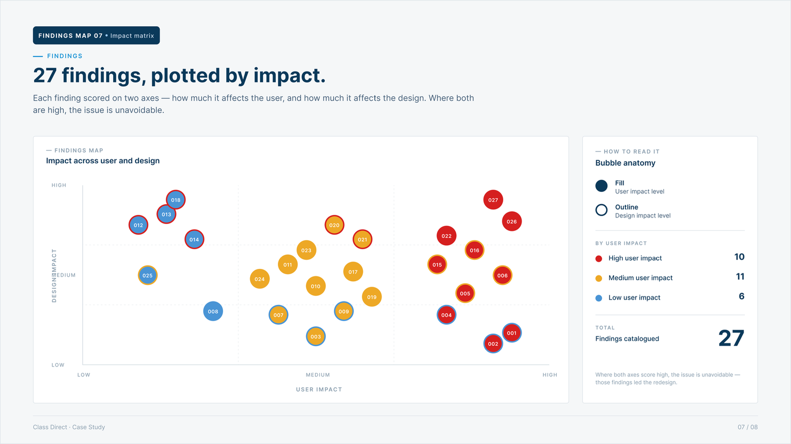
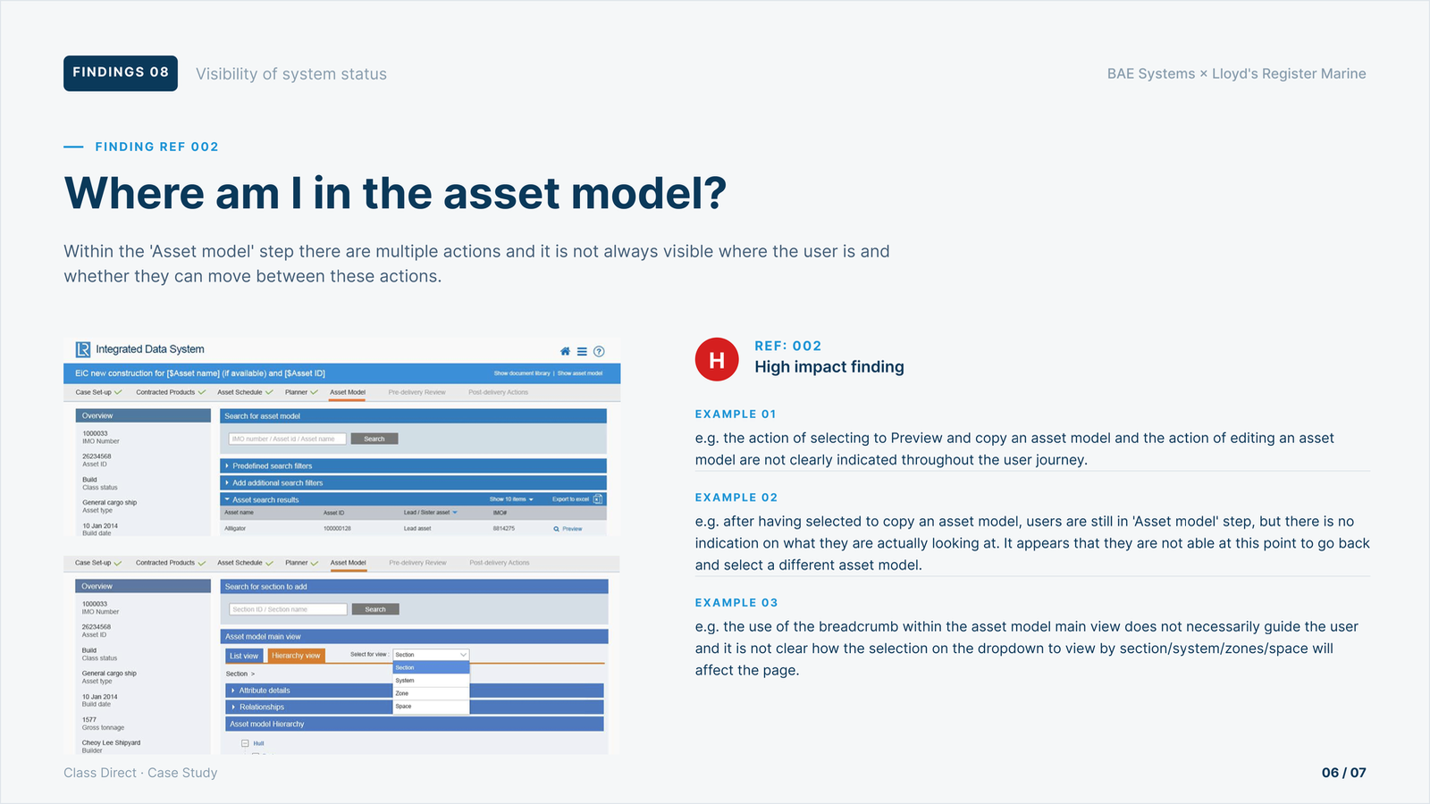
Every finding was catalogued and individually written up — what was wrong, why it mattered, what the user saw, where in the journey it surfaced. One representative example, below: a high-impact finding inside the asset-model step, with three concrete examples of where users got lost.
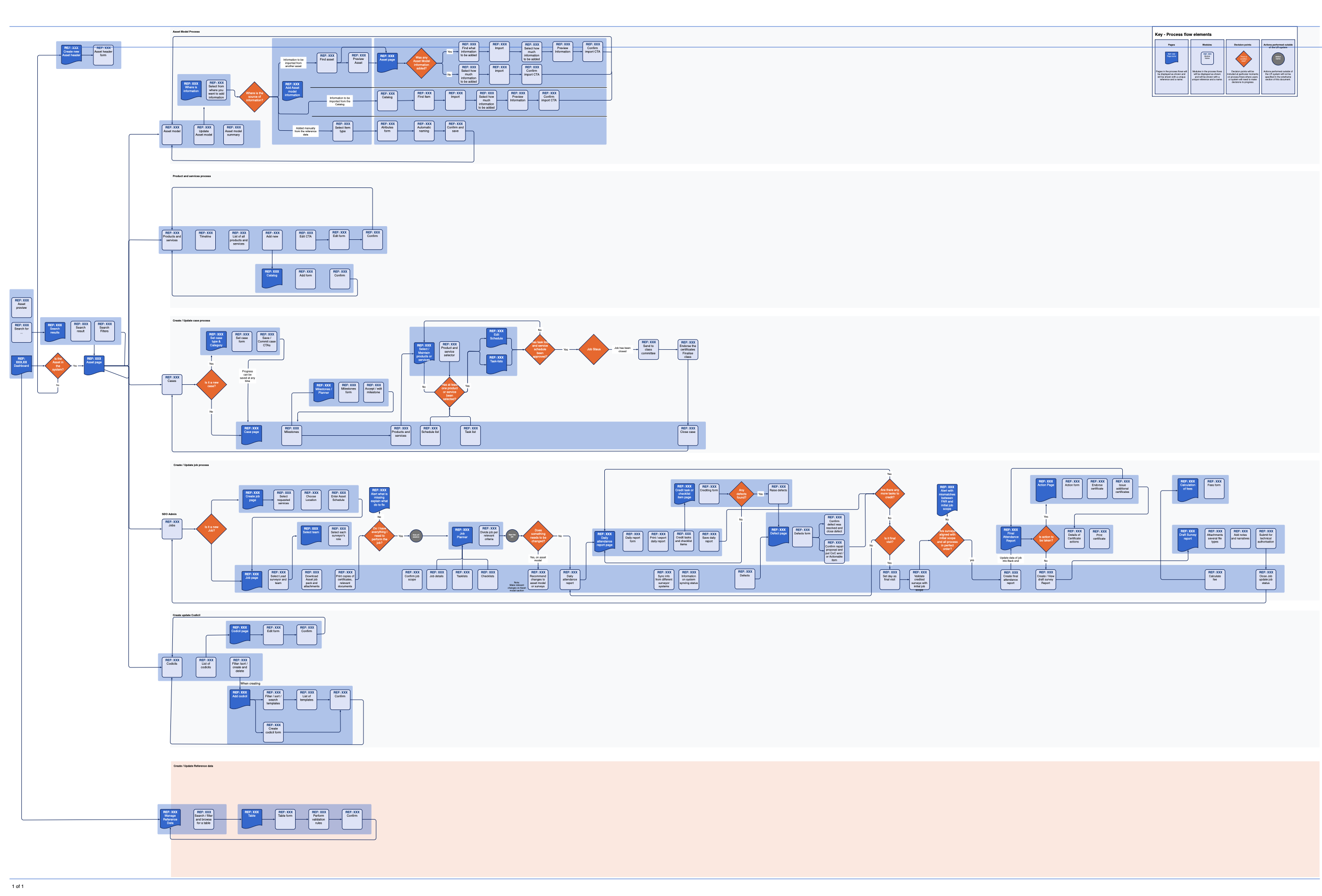
With the diagnosis and the user picture in hand, I designed the new structure: a complete sitemap based on how users thought about the work, not how the back-end services had grown organically. Two paired deliverables came out of that work — and together they're what made the engagement scopeable to a fixed price.
The first was the system process map. Six process areas, two-hundred-plus nodes across pages, modules, decision points and actions performed outside the system. Every capability the platform would need to deliver, traceable to where it lived in the journey.
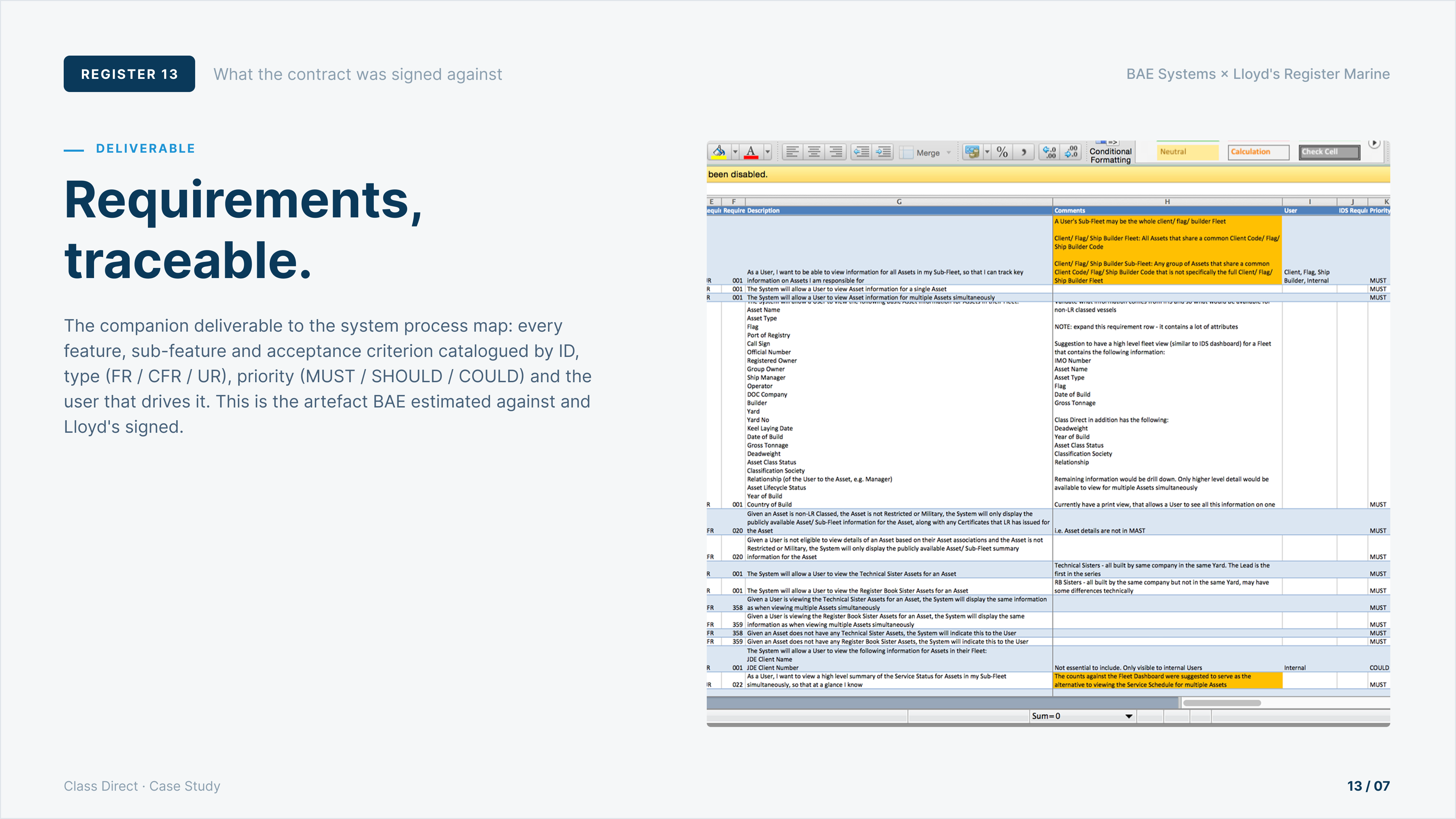
The second was the requirements register — a master spreadsheet that turned the process map into something the build team and the client's finance team could both sign. Every feature ID, every sub-feature, every functional (FR) / content (CFR) / user (UR) requirement, every MUST / SHOULD / COULD priority, traceable back to the user picture and the system map. That — the map plus the register, sitting next to each other — is what made the work scopeable to a fixed price. The contract was signed.
The internal tool — built where the work happens.
With a fixed-price contract secured, delivery began on the internal-facing application — the tool surveyors and operations teams use day-to-day. The work was structured around three core challenges: navigation that mirrored how surveyors actually thought about their work, a clear path through certification scheduling, and a way to surface which assets needed attention and when.
The team grew to four designers, with the Head of UX still on the project one day a week — but increasingly stretched across other engagements. I became the day-to-day lead reporting to him, running design across the team and serving as the primary client point of contact.
This was the phase where the Phase 0 thesis about where the work actually happens first paid off in delivery. The surveyors' work split between port-side and desk-side, and the internal tool followed that split — a desk-side experience for fleet-level oversight and scheduling, and a field-side experience for the surveyor standing on a vessel. The two shared a model underneath. Status seen at the desk matched status seen on deck.
Across the build, I was responsible for tracking and prioritising user feedback into a structured backlog the engineering teams could action. With ~50 developers split across Leeds and Kuala Lumpur, this wasn't just a UX tool — it was the mechanism that kept the redesign aligned across time zones.
The single artefact that proves the strategy was a deliverable in itself is the wireframe-with-requirements board. Every UI region on the wireframe is colour-coded back to the requirements register on the right: Asset / Fleet Information in blue, Codicils and Certificates in green, Documentation in purple, Service Schedule in dark teal, User Support in red, and so on.
This is the visual that made the redesign defensible across every conversation that followed. Any stakeholder could trace any screen region back to the requirement it satisfied — and any requirement back to the screen region that delivered it.
A second wireframe pair shows the depth those templates carried. The customer Ship Details wireframe surfaces COC / Memos / Surveys / Certificates as cards at the top, then a multi-year Survey Planner timeline across Machinery, Hull, Lifting Appliances and Statutory groups. The mobile Survey Planner translates the same model into a stacked list — Hazel, Gwendolyn, Archie, Forsythe — each vessel with expandable Codicils, Hull, Machinery, Refrigeration and Statutory sections, and overdue / due / part-held status surfaced inline.
The customer-facing app, end-to-end.
The success of Phase 1 triggered a second engagement: the customer-facing application that Lloyd's Register's external clients — shipping companies, operators, owners — would use to view their fleet, request certification work, track its progress, and download the reports the surveyors produced.
This was a deliberate inflection point in my role. The Phase 1 UX designer had grown into the work, and the right call was to hand them the internal tool — they had earned it, and I needed to be where the bigger problem was. I took Phase 2 end-to-end. Research mine alone; for design and delivery, a team of six — two UX designers (myself plus a peer), an Art Director, two UI Designers, and a sixth UX designer brought in for three weeks.
One of the most consequential design decisions in Phase 2 was how to surface asset status. Customers needed to scan dozens — sometimes hundreds — of marine assets at a time and quickly identify which needed attention. We tested several metaphors and landed on a card-based pattern. Each card surfaced status, priority signals, and the key actions a customer would need to take. The same pattern carried into the vessel list (a grid of dozens of cards), the survey timeline (status across time as well as across vessels), and the ship-detail view (Registry, Principal Dimensions, Rule set, Ownership in a five-block panel).
The Phase 0 thesis about where the work happens paid off again — for a different audience. Lloyd's Register's customers weren't at one place either. Office one moment, port the next. Phase 2 shipped its own dual-platform experience: desk-side for fleet-level planning, field-side mobile for the customer looking up a specific vessel they were on or near.
For a customer chasing a single job, the field-side mobile experience surfaced the things a job actually needs: the ship in context, the lead surveyor's location and date, the four core downloads (Final Service Report, Final Attendance Report, Thickness Measurement Report, ESP Report), and a check-marked list of services included. Tap a service and the screen unfolded into a real survey checklist — USCG 46 / CFR 39 / IMO MSC Circular 585 regulatory references, with 122900–122950 question IDs and Yes / No / Non-applicable answers grouped under Survey preparation, Ship office documentation, and Checklist groups.
Before the wireframe and the hi-fi, the filter-by-ship-type pattern started on paper. Asset-type filter sketches for desktop, tablet, mobile and a mobile v2 sat side-by-side on a single notebook page: a horizontal scroll across the desktop grid, a carousel on the tablet when a second-level tier is selected, a step-through model on mobile, and a v2 mobile alternative with multiple dropdowns. The decisions made on this page carried straight into the wireframe and then the hi-fi.


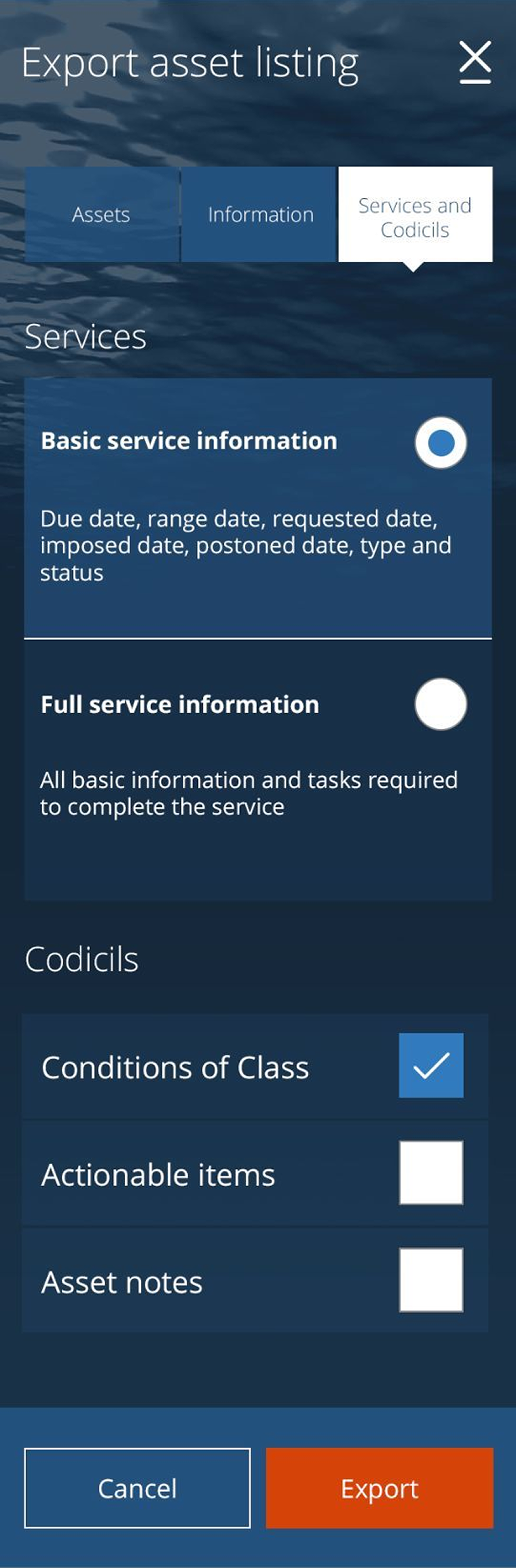
Beneath every status pill in the customer-facing app sits the regulatory weight of marine certification. The Vapour Emission Control Systems checklist — and dozens like it — is what gives the booking flow its high-stakes context. A customer building a fleet snapshot for an audit, an insurer, or a charter party can export selected ship data in selected formats: three tabs (Assets · Information · Services and Codicils), bulk add / remove, and a choice of depth (Basic service info / Full service info, plus Conditions of Class / Actionable items / Asset notes toggles).
From comment to ticket, traceable.
The booking flow — the most consequential customer journey — borrowed proven patterns from e-commerce UX, adapted for the high-stakes context of marine certification. Clear progress signals at every step, persistent visibility of what had been selected, recoverability if something went wrong. In usability testing, users moved through it confidently.
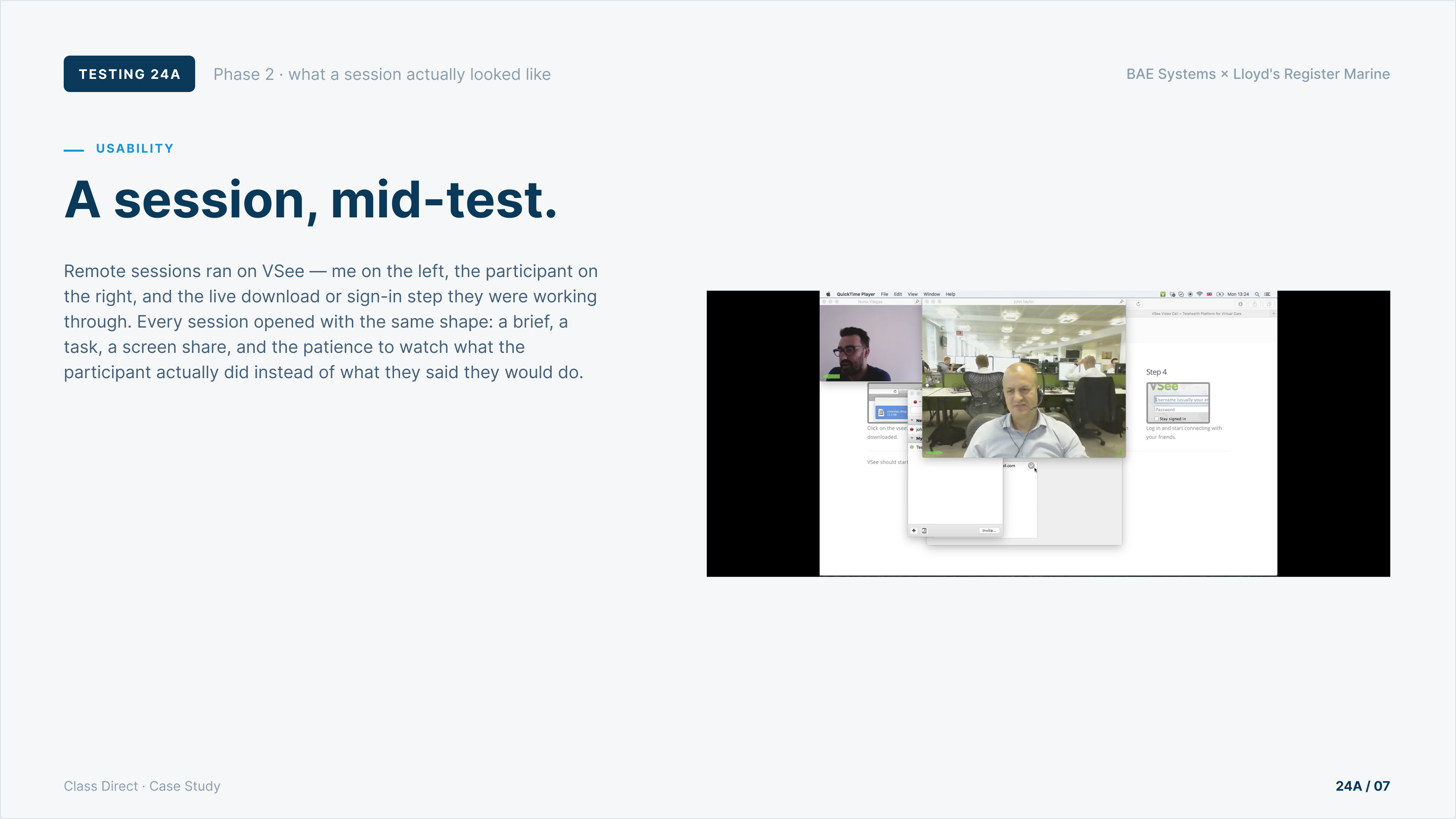
Remote sessions ran on VSee — me on one video tile, the participant on another, and the live screen they were working through alongside. Every session opened with the same shape: a brief, a task, a screen share, and the patience to watch what the participant actually did instead of what they said they would do.
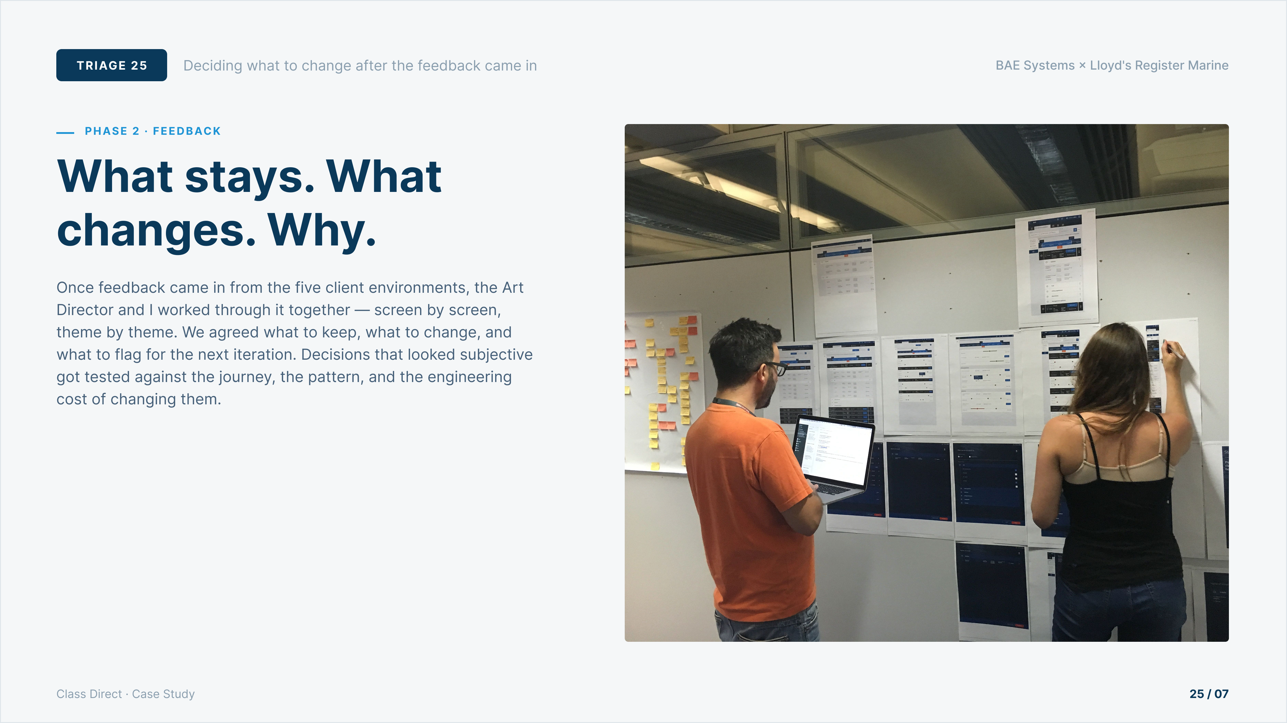
Once feedback came in, the Art Director and I worked through it together — screen by screen, theme by theme. We pinned the printed Class Direct screens across the boardroom wall, lined the post-it column with every piece of feedback, and agreed what to keep, what to change, and what to flag for the next iteration. Decisions that looked subjective got tested against the journey, the pattern, and the engineering cost of changing them.
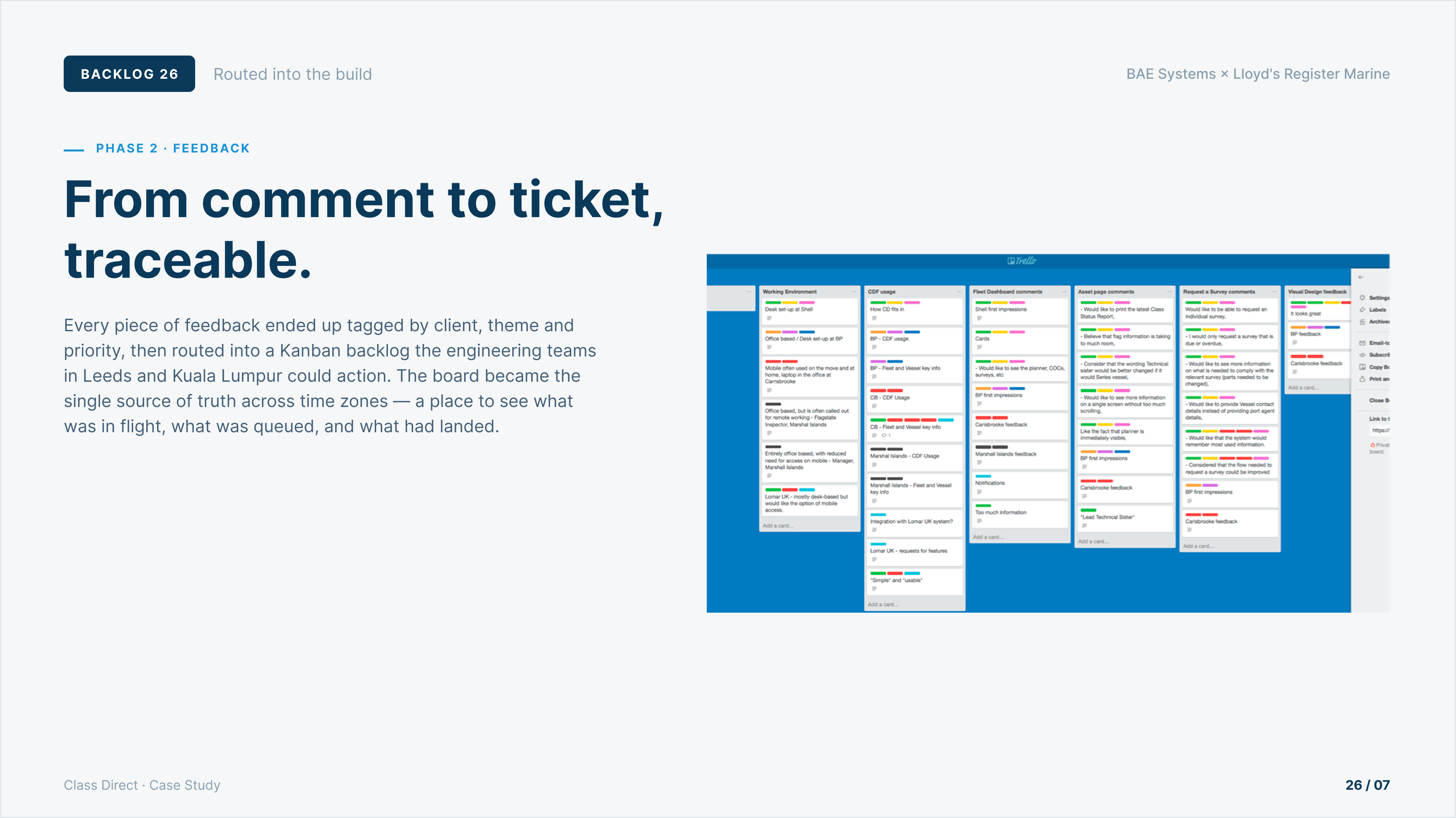
Feedback came in from five client environments — Shell, BP, Carisbrooke, Marshall Islands, Lomar UK — across working environments, dashboard impressions, asset-page comments, survey requests, and visual design. Every piece of it ended up tagged by client, theme and priority, then routed into a Kanban backlog the engineering teams in Leeds and Kuala Lumpur could action. The board became the single source of truth across time zones — what was in flight, what was queued, and what had landed.
Design strategy, done well, is commercial work.
Lloyd's Register taught me that design strategy, done well, is commercial work. The 9-week sprint that secured a £1.5M contract wasn't a discovery phase that happened to lead to a contract — it was a deliverable in itself. The redesign that followed was the easier half. The harder half was producing enough clarity, fast enough, that a fixed-price could be signed with confidence on both sides. That's the discipline I've used in every senior role since: design as the thing that de-risks decisions, not just the thing that comes after them.
What it moved.
Other work.
Let's
talk.
Curious how I can support you and your team? I'd love to hear what you're working on.