My TR
Rebuilding the account home of the world's largest financial institutions
Hired to document someone else's designs, I noticed the foundations were broken. Over 18 months, that observation grew into a full redesign that earned eight international design awards and scaled the team from 2 to 18.

The shape of the work.
- Thomson Reuters
- With handoff into the Refinitiv era
- Tier-1 banks, legal, government
- 18 months
- IC documenter → 4-team lead
- Pre-handoff to Refinitiv era
- IC documenting → IA lead
- Vision & innovation design
- Design across 4 Scrum teams
- 8 designers across 4 Scrum teams
- Inside a design org that grew
- 2 → 18 over project lifetime
The good bits
are behind a door.
Most of this work lives under NDA — clients, internal screens, the numbers I shouldn't be shouting about. Drop the password and the rest of My TR unlocks. (One password, all projects, this session.)
The brief I was hired for wasn't the project that mattered.
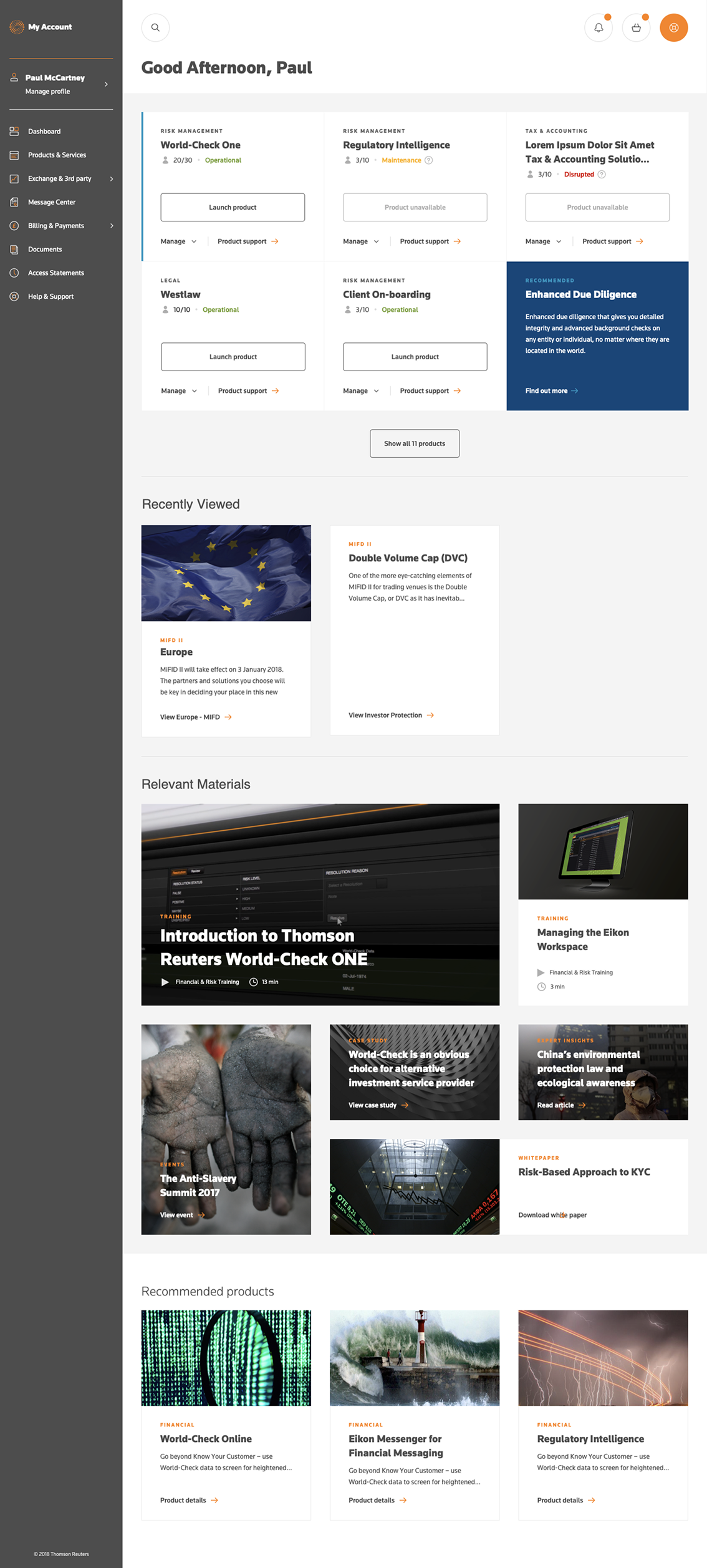
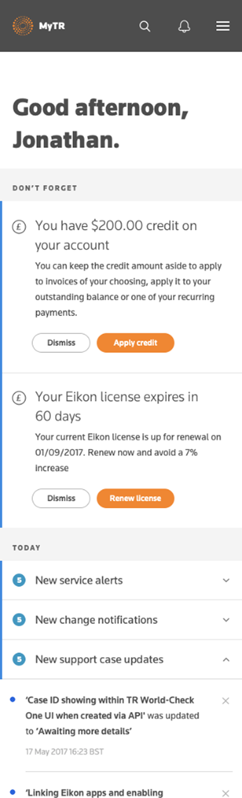
My TR was the account home for some of the most demanding users in software: tier-1 banks, legal firms, and government bodies managing their Thomson Reuters licenses, billing, and support. For users like these, the tool isn't a "nice to have" — it's how procurement officers, IT admins, and operations teams keep critical financial software running.
By the time the redesign was commissioned, the platform was failing on three fronts at once. The visual design was dated. The interactions frustrated even sophisticated users. And core business tasks — renewing a license, finding an invoice, getting support routed correctly — had degraded to the point where customers were either leaving or jamming the support lines instead of self-serving.
The business pressure was real on every axis: customer retention, support cost, license revenue, and Thomson Reuters' broader digital agenda all rode on this tool.
A redesign had already been commissioned. An external agency had produced the new designs. I was hired into a 2-person team to document them. That's not the project I ended up running.
I didn't grow into the role by being promoted.
I joined as one half of a 2-person team, reporting to the Head of UX. The original brief was narrow: document the external agency's designs so they could be built.
As I worked through the documentation, I realised the information architecture underneath the new designs was broken — and that several interaction patterns could be substantially improved. I raised it, first with my Head of UX (who agreed immediately — we'd worked together before) and then with internal stakeholders across product and engineering.
The shift in scope was not without friction. The original designs had been produced by an external agency, and moving from documenting their work to questioning it created tension that took time to work through. Internally, stakeholders were open. They agreed to slow the documentation deliverable so I could show evidence-led recommendations, and over the next three to six months — as my findings were independently validated by a separate research agency running diary studies — the scope of my role expanded.
I took over the information architecture workstream. Then innovation and vision design. By the end of the 18 months, I was leading design across four Scrum teams with eight designers, and the broader design organisation had grown from 2 to 18.
I grew into the role by earning each next piece of scope through the work.
Evidence on the wall.
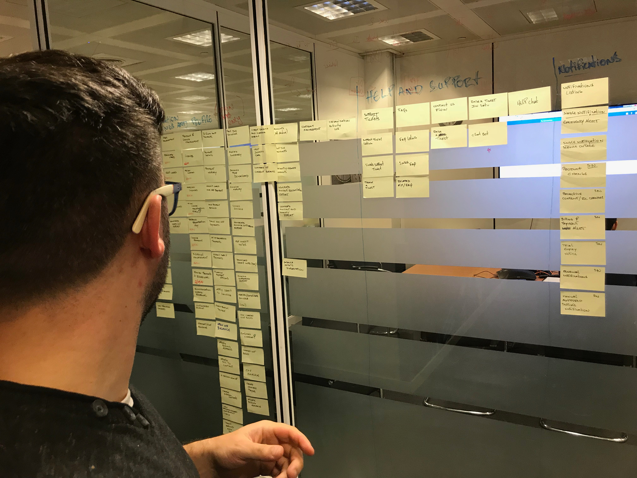
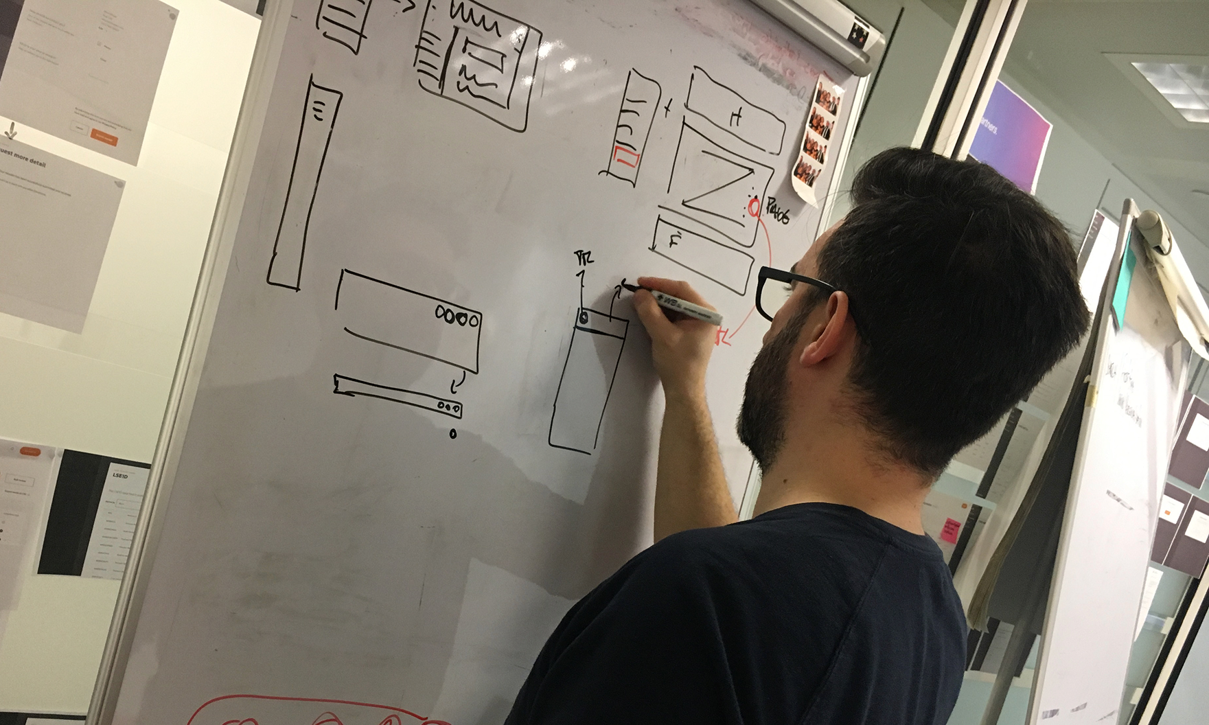
Formal user research wasn't available in the first phase, so the evidence had to come from the tool itself. I ran a structured heuristic evaluation and mapped the existing site's information architecture end to end — physically, on the walls of the office, with every screen of the existing tool printed out and grouped by user task.
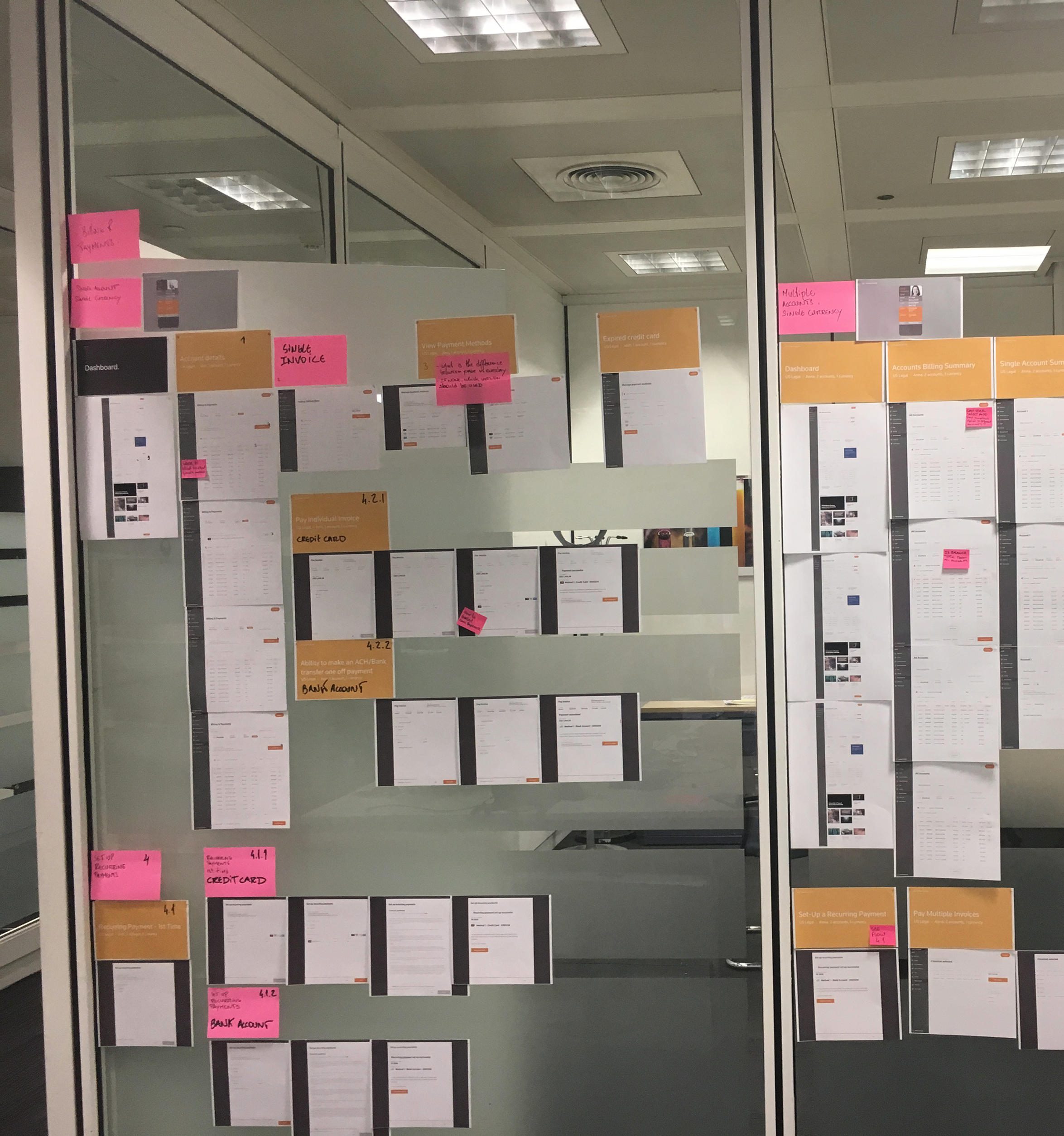
What emerged was clear: the categories that organised the platform didn't reflect how users actually thought about their accounts. Tasks that should have taken three clicks took eight. Critical paths — like license renewal — were spread across screens that didn't acknowledge each other.
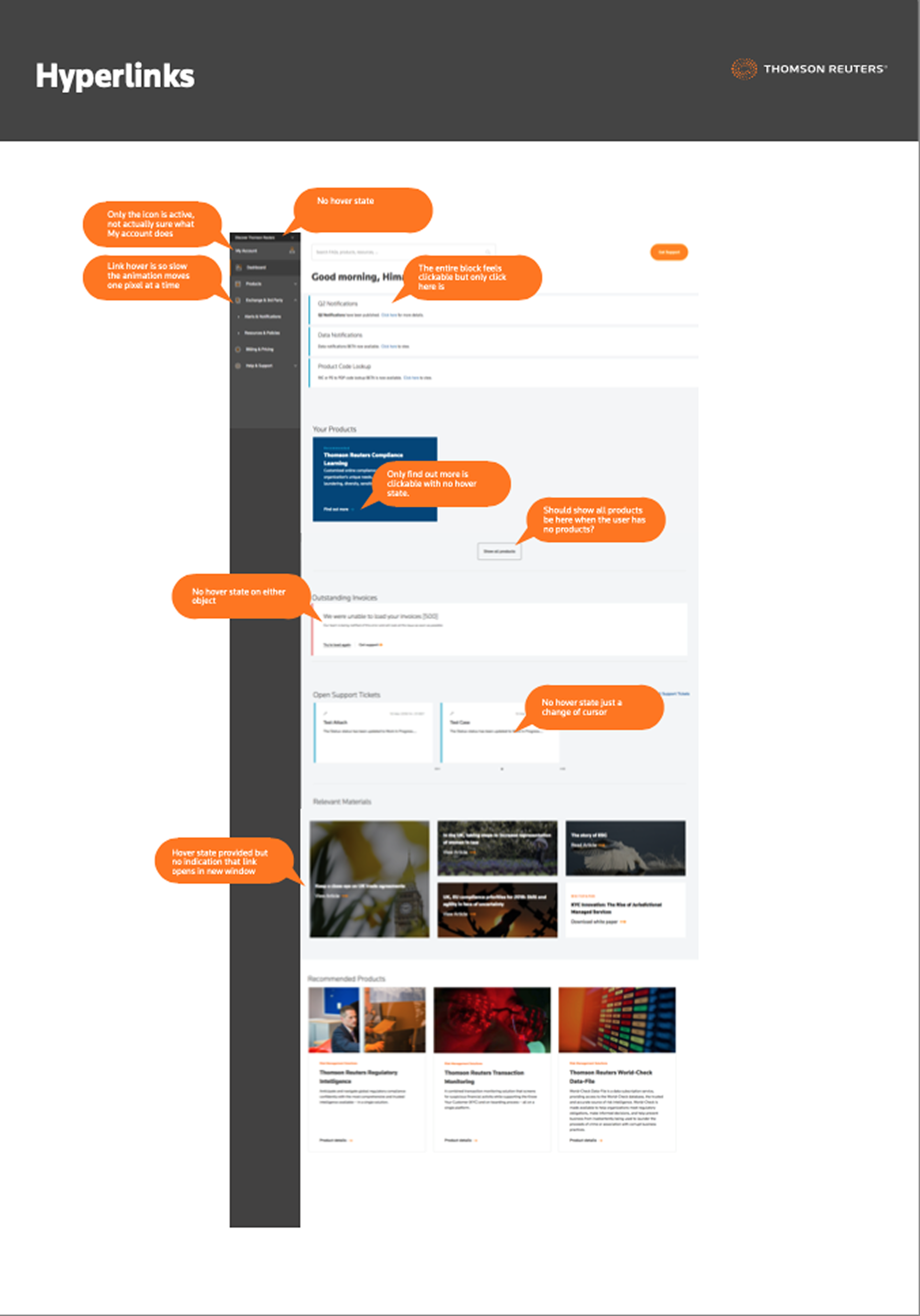
The findings weren't subtle. Half the interactive elements on the homepage didn't behave the way users expected. Hover states were missing or broken. Click targets contradicted their visual affordances. The platform wasn't just dated — it was actively eroding the trust of the users it most needed to keep.
When a separate research agency was later commissioned to run diary studies with real users, their findings independently confirmed what the heuristic work had already shown. The convergence between an internal expert review and external field research was the unlock — it gave stakeholders the confidence to expand the scope of the redesign.
Around the jobs users came to do.
With buy-in secured, I rebuilt the IA from the ground up. The principle was simple: organise the platform around the jobs financial institutions actually came to it to do — manage what we have, change what we have, pay for what we have, get help — not around Thomson Reuters' internal product taxonomy.
I worked the new structure out on the wall, the same way I'd diagnosed the old one. Every task users needed to perform was written on a sticky note, then grouped, regrouped, and tested against real user journeys until the categories held up.
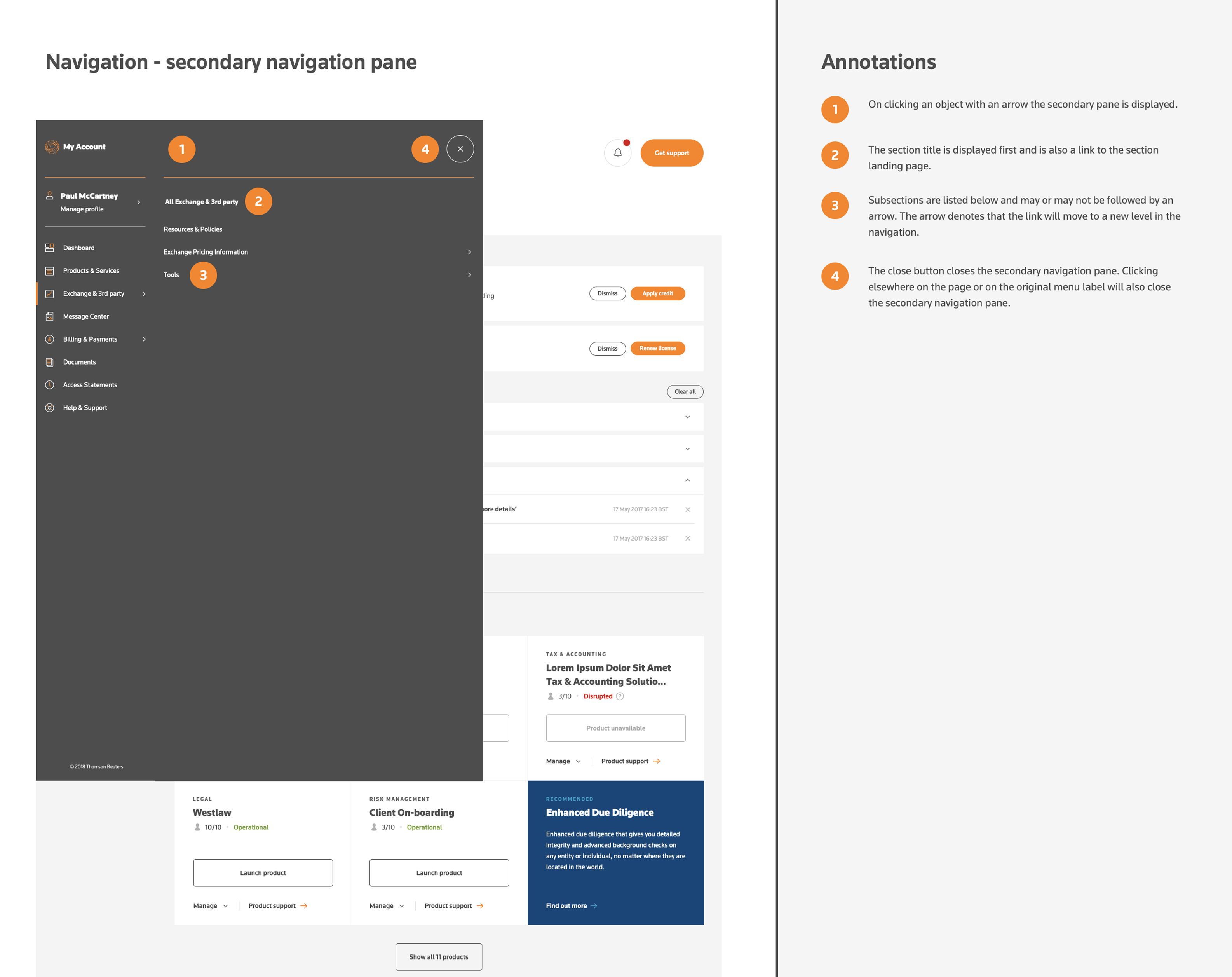
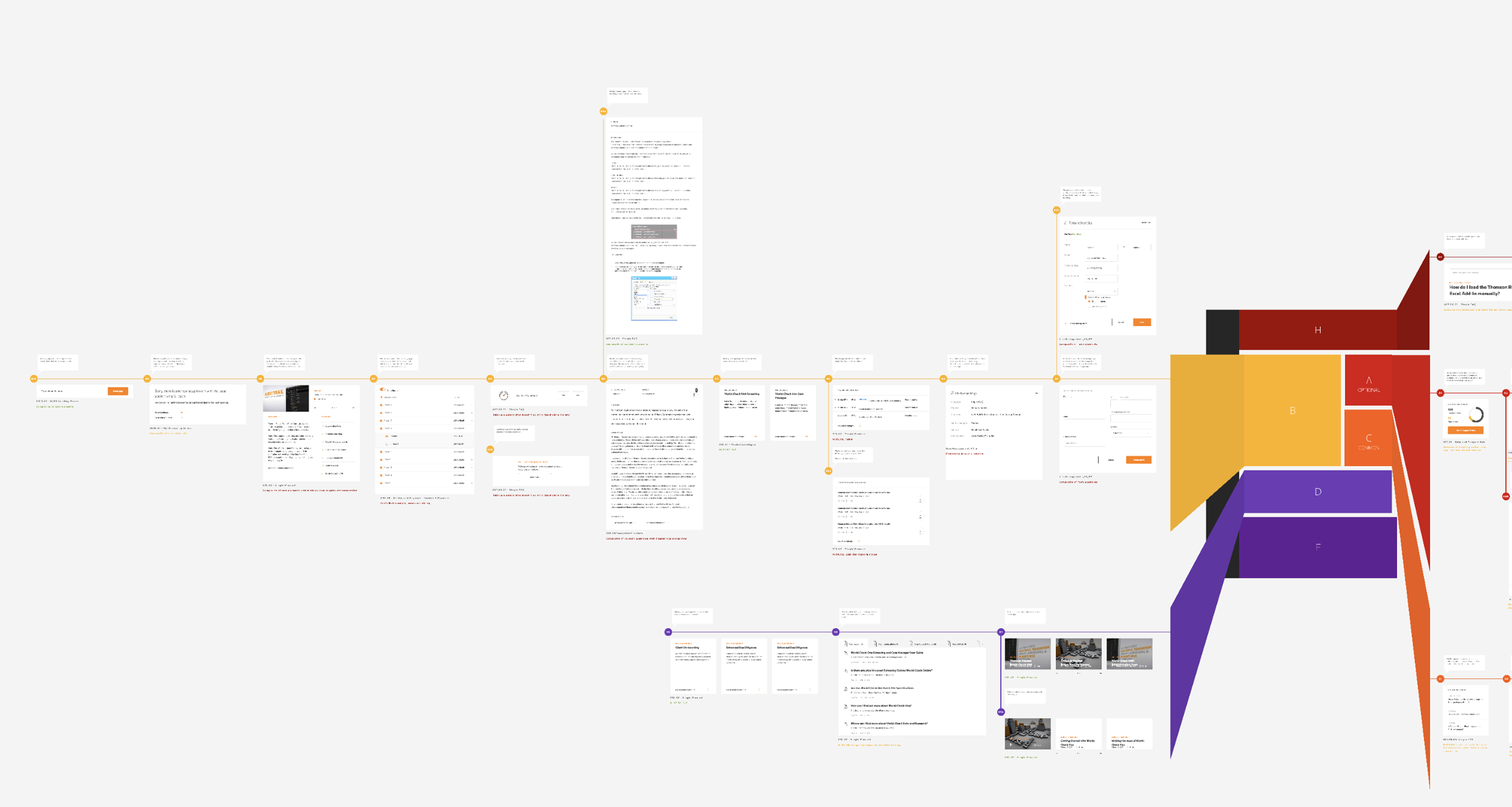
The output was a new sitemap and a new navigation model — one that exposed the right things at the right level, and that mapped cleanly to how the engineering teams' back-end services were actually structured once you stopped fighting them.
This shift in structure was the foundation everything else was built on. It made the design system possible. It made the future-state visions credible. And it made the engineering teams' lives easier.
A target the team could build toward.
Once the IA was holding, I shifted focus to defining where the platform should go next. Vision design — future-state concepts a year or two ahead of what was shipping — gave the broader team a target to design and engineer toward, and gave product leadership a credible artifact to argue for the next round of investment.
This was the work that most explicitly bridged IC and leadership for me: I was still hands on the file, but the output was a strategic asset, not a feature.
As the visions matured, I decomposed them into reusable modules — patterns that could be combined and recombined to compose any page in the system. This was the bridge from "what could the future look like?" to "what do we need to build to get there?"
The artifact that made everything sustainable.
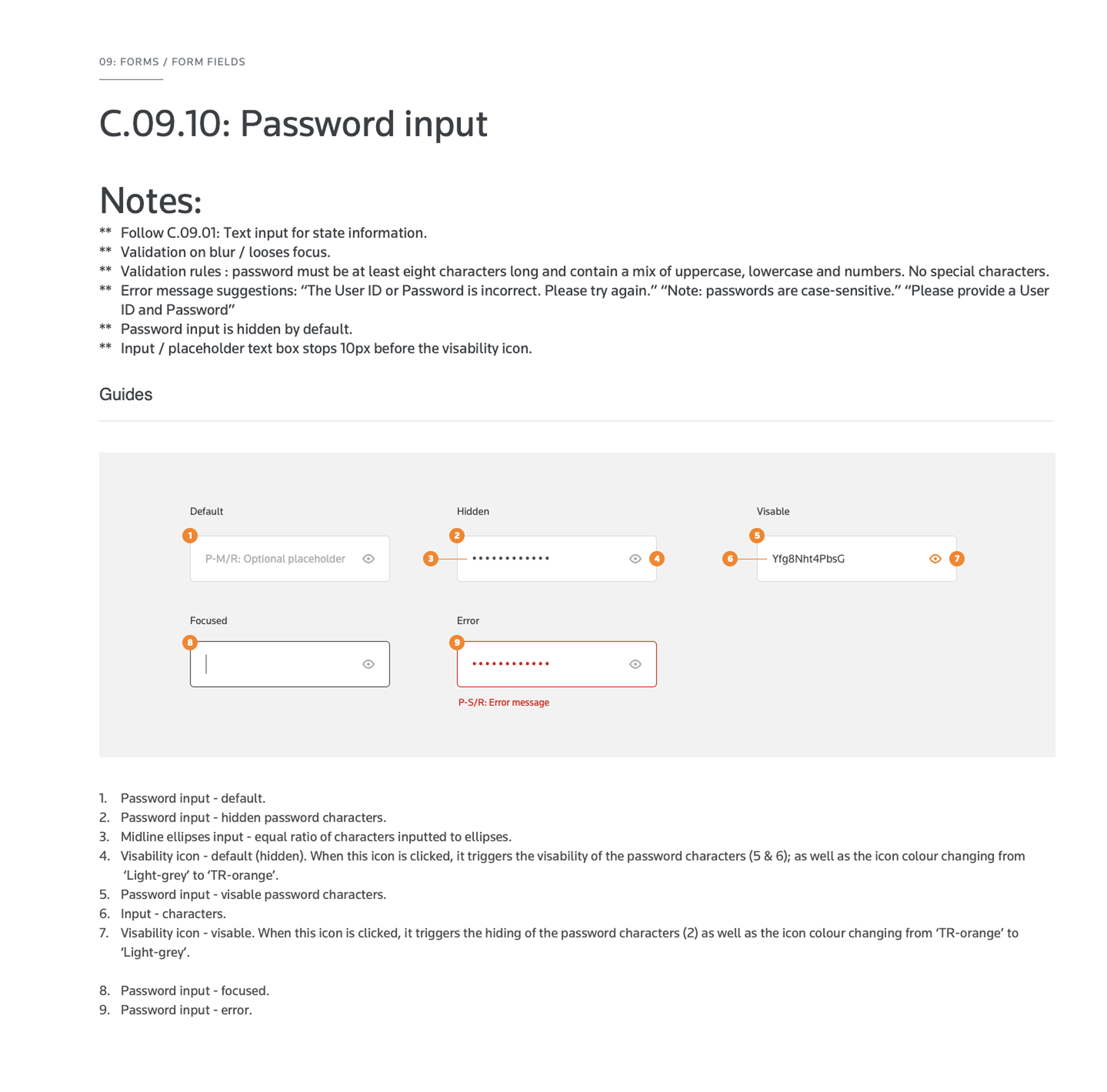
A full design system was built in parallel with the redesign work. As the design team grew from 2 to 18, the system became the only realistic way to ship consistent work at speed across four Scrum teams.
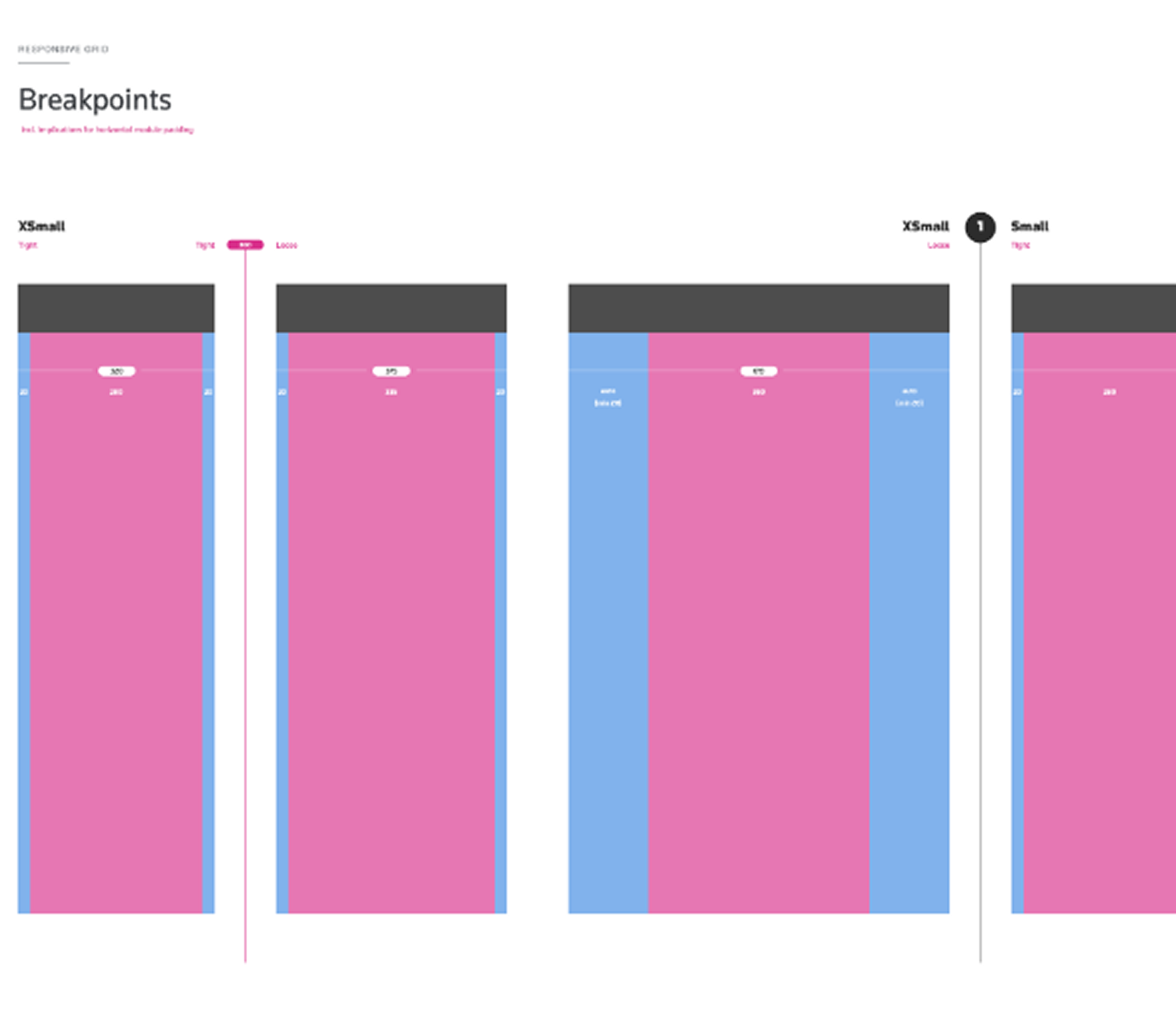
It governed components, patterns, and visual language across the entire platform — every input, every navigation pattern, every page composition documented to production specification. Responsive foundations from day one — every component documented across breakpoints, with a grid system that scaled from extra-small mobile up through tablet and full desktop widths.
The design system was the artifact that made everything else sustainable. Without it, the team's later velocity would not have been possible.
A platform that shipped.
The redesigned platform shipped as a coherent product across desktop and mobile, with the design system supporting every screen and every breakpoint.
Mobile was treated as a first-class citizen, not an afterthought. The same design system that governed the desktop experience governed mobile, and the IA that worked on a 1440px monitor worked on a 375px phone.
Three juries. One conclusion.
The work was recognised by three independent award bodies, with eight awards across UX, IT, and international business categories.
- WinBest UI
- WinBest IT Team of the Year
- WinBest Home Page
- WinBest User Experience
- GoldInternational Business
- SilverEngaging the Customer Online
- WinIT Project of the Year
- WinBest Interface Design
- WinBest Homepage
The convergence is, to me, the meaningful part of the recognition. Three juries with different criteria — UX practitioners, IT industry analysts, and international business judges — reached the same conclusion about the work. It held up by every standard it was measured against.
The work that matters is often the brief you weren't given.
This is the project where I learned that the most important design decision is often the one that happens before anyone asks you to design — the moment you choose whether to do the brief in front of you or to question it.
Documenting someone else's work was the brief I was hired for. Reframing it was the work that mattered.
Every senior role I've taken since has involved some version of that same judgment call.
What it moved.
Other work.
Let's
talk.
Curious how I can support you and your team? I'd love to hear what you're working on.