Taskize
Saving the platform behind 500+ of the world's investment banks — and designing where it goes next
When two top-tier clients gave Taskize 12 months to fix the product or lose them, I led the redesign that won back their trust. Over three years I lifted the SUS score from 51 to 65, brought every shipping design to AA accessibility standard ahead of EU regulation, helped generate ~£1.2M in combined pipeline and retention — and designed the strategic vision the company is now building toward: the Exception Monitor, a re-foundation of Taskize as the aggregator of post-trade exceptions for the industry.

The shape of the work.
- Taskize · a Euroclear company
- Post-trade exception resolution
- Used by 500+ investment banks
- ~3 years
- 2022 → 2025
- Hybrid / remote
- Lead Product Designer
- 1 junior product designer reporting in
- Connective tissue across disciplines
- 3 Product Managers
- 16 Developers
- Direct client workshops + roadshow
The good bits
are behind a door.
Most of this work lives under NDA — clients, internal screens, the numbers I shouldn't be shouting about. Drop the password and the rest of Taskize unlocks. (One password, all projects, this session.)
An important idea wrapped in a broken product.
Taskize had built something genuinely important: a platform for resolving post-trade exceptions, used by operations teams at over 500 of the world's top investment banks. The idea worked. The product behind it didn't.
By the time I joined, the warning lights were flashing. The platform's structure mirrored how the backend engineers thought, not how operations users worked. Contrast was poor. Information density overwhelmed even experienced users. And two of Taskize's top-tier clients had made the message explicit:
“If things don't improve in the next 12 months, we're out.— Top-tier client · during onboarding
Internally, everyone agreed something was broken. Nobody agreed on what, specifically, or what to do about it.
Connective tissue across disciplines.
I joined as Lead Product Designer with one junior product designer reporting to me. The brief was open: figure out what was wrong, get the top clients onside, and rebuild the foundations.
In practice, this meant being the connective tissue between disciplines. I ran the research, set the design direction, shaped the long-term vision, delivered the fixes that shipped, and held the line on cross-team alignment. I was the central point of contact between product leadership, the engineering teams, internal stakeholders, and — increasingly — the clients themselves, through workshops and a roadshow that took the new product vision directly to the banks that mattered most.
The work expanded over the three years. What started as "fix the most urgent usability issues" grew into rebuilding the design process, introducing accessibility as a foundational standard, building the scalable system that made everything sustainable, and — at the end — defining the strategic vision the business is now executing against.
Generalised frustration → specific evidence.
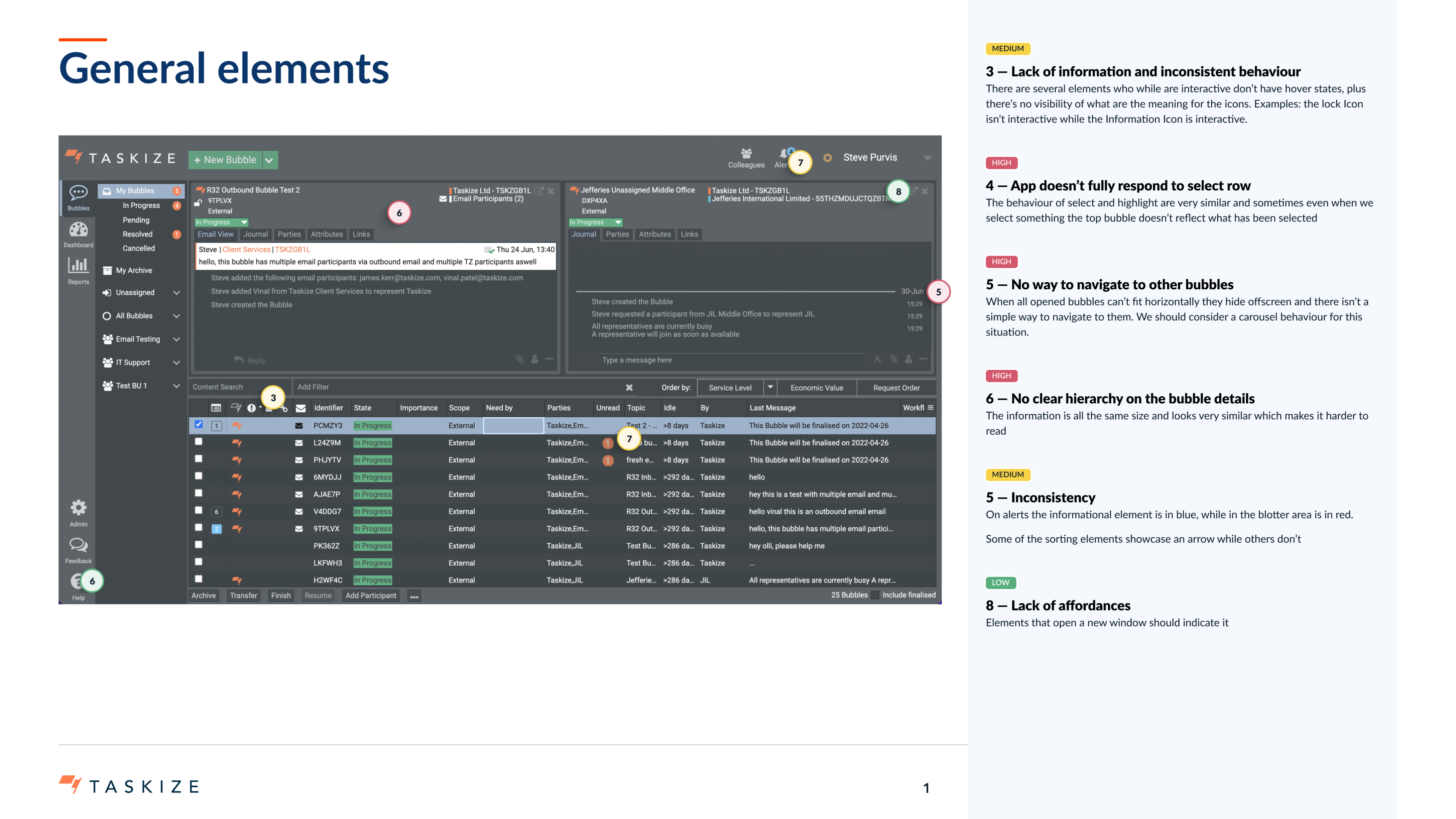
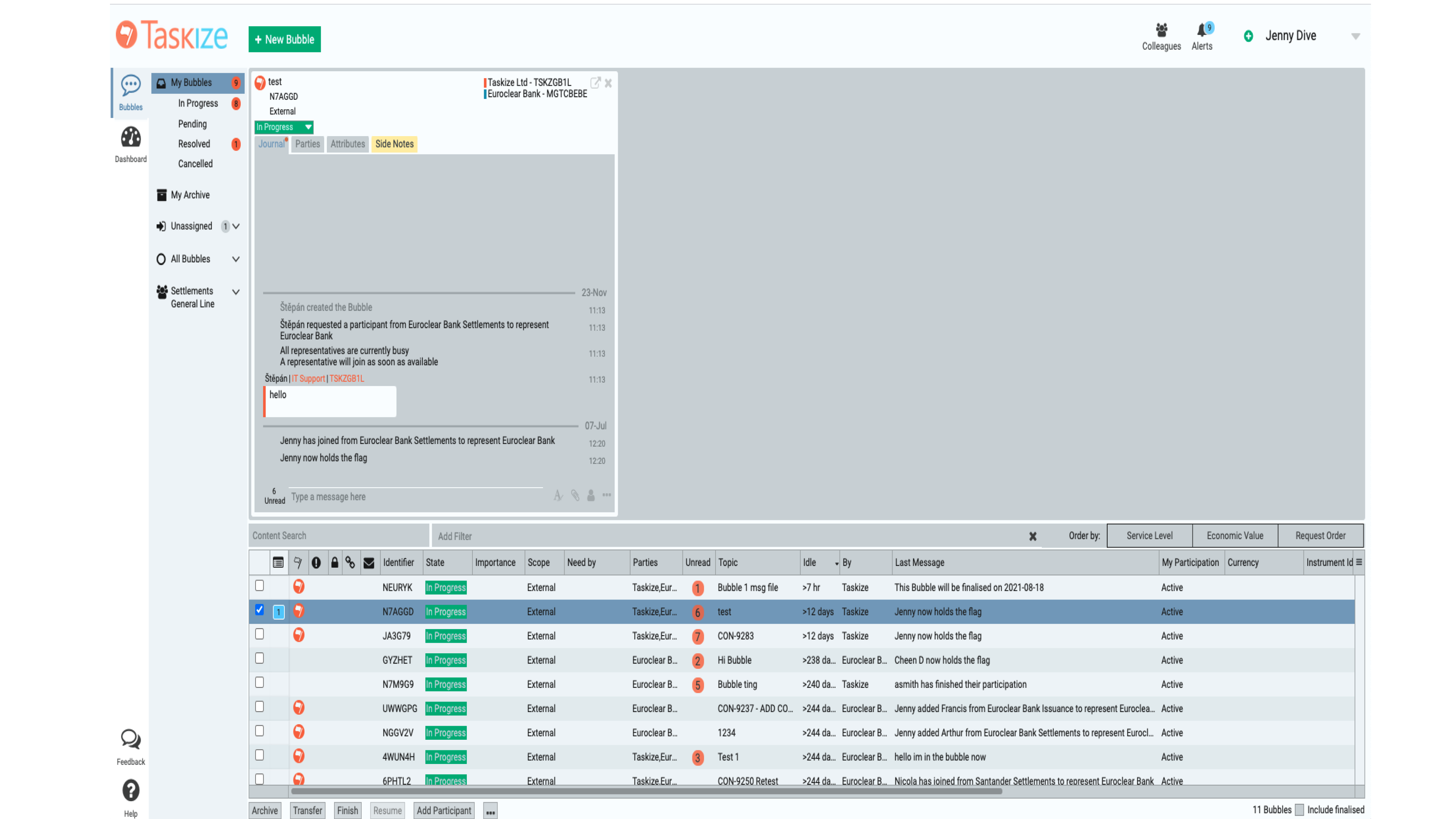
The first move was to ground the team in evidence rather than opinion. I ran a heuristic evaluation and an accessibility audit against the live product. Then I introduced something Taskize hadn't had before: a System Usability Scale benchmark, with 75 real users across the top customers responding.
The result was a SUS score of 51. Below average. Specifically — and this mattered for the case I was about to make — below the threshold where users feel a product is acceptable.
Everyone inside Taskize already knew the product wasn't working. The audit and the SUS score told them, for the first time, exactly how badly and exactly where. That shift — from generalised frustration to specific evidence — was what made the next 12 months possible.
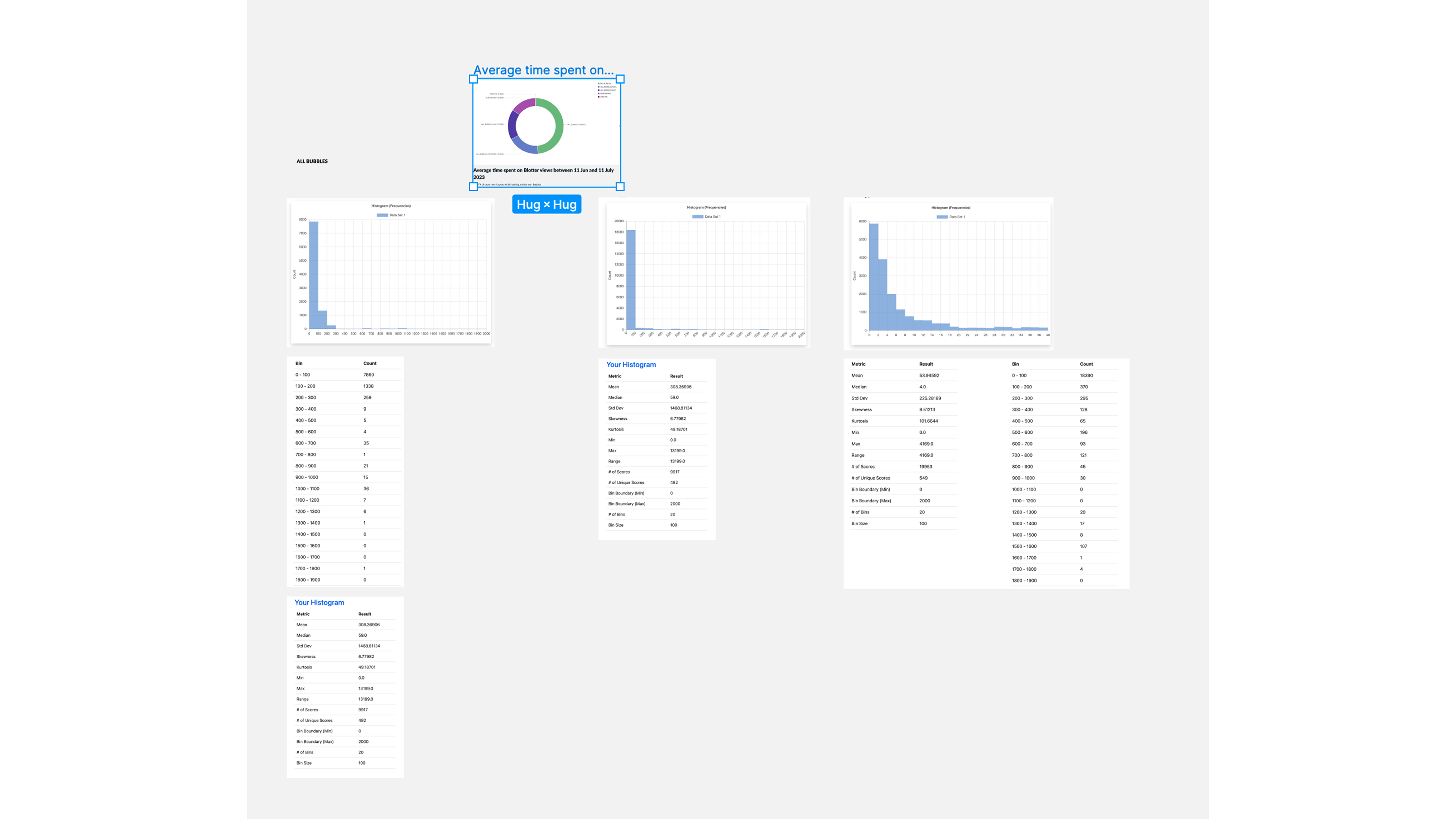
I also stood up the data infrastructure that let the team keep watching. Lightweight UX instrumentation on the blotter and core flows fed back into histograms and descriptive statistics (mean, median, standard deviation, skew, kurtosis) for time-spent and interaction patterns — so that "is it getting better?" stopped being a guess.
Buying time was the game.
With the diagnosis in hand, I led a focused 6-month UI refresh aimed at the most acute usability blockers. The goal wasn't a redesign yet. The goal was visible, tangible progress — fast enough to give the business credibility with the two clients holding the 12-month ultimatum.
It worked. The most frustrated clients extended their timelines from 12 months to 18.
That six-month extension was the entire game. It bought the runway to do the work properly — research, vision, system, redesign — instead of patching forever.
From reactive fixes to deliberate product thinking.
With breathing room secured, I moved Taskize from reactive fixes to deliberate product thinking. I introduced a human-centred design programme, shaped a structured discovery process alongside product, and gradually built a lightweight UX monitoring framework so we'd never again be in a position where the team couldn't tell whether things were getting better or worse.
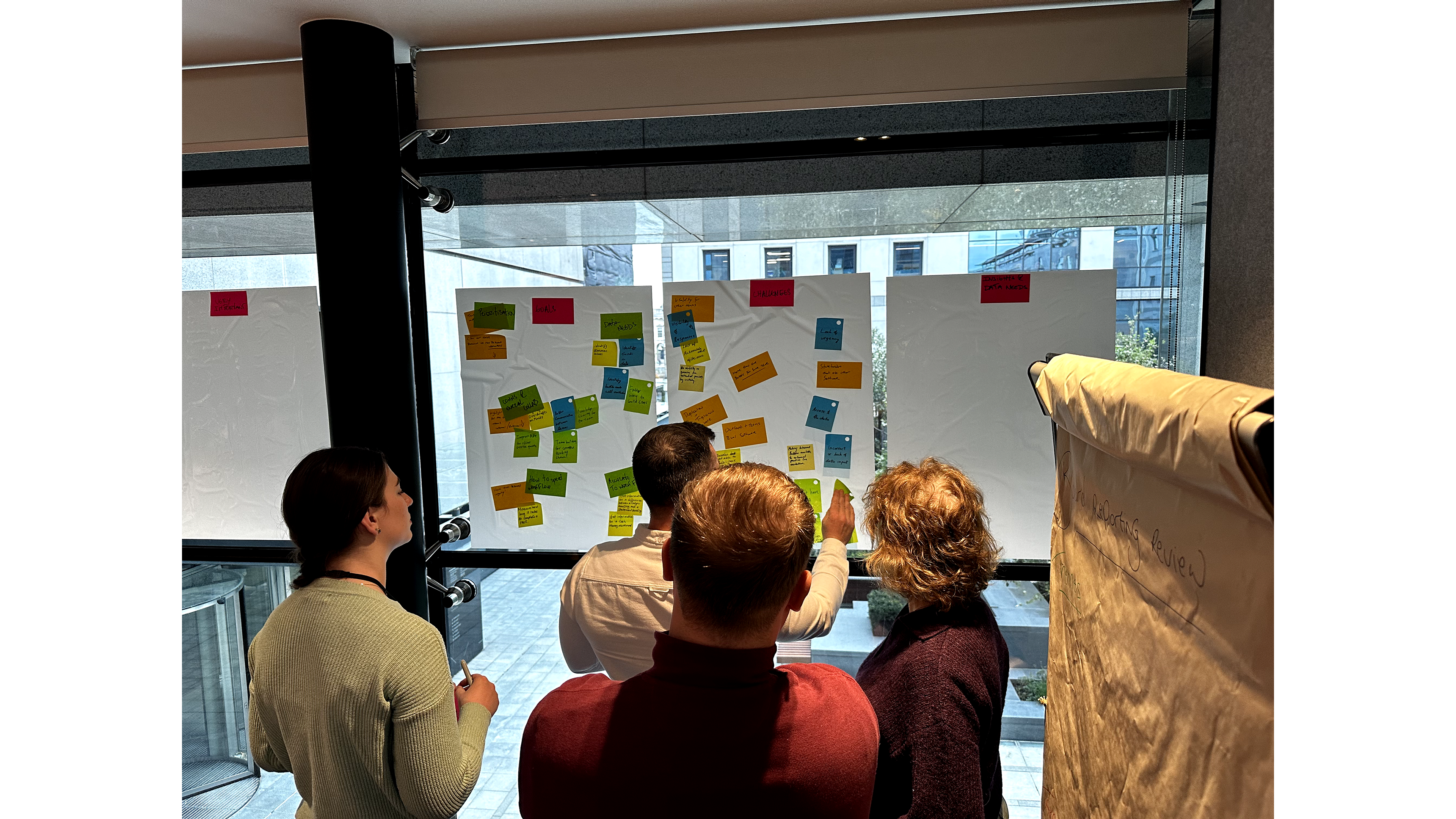
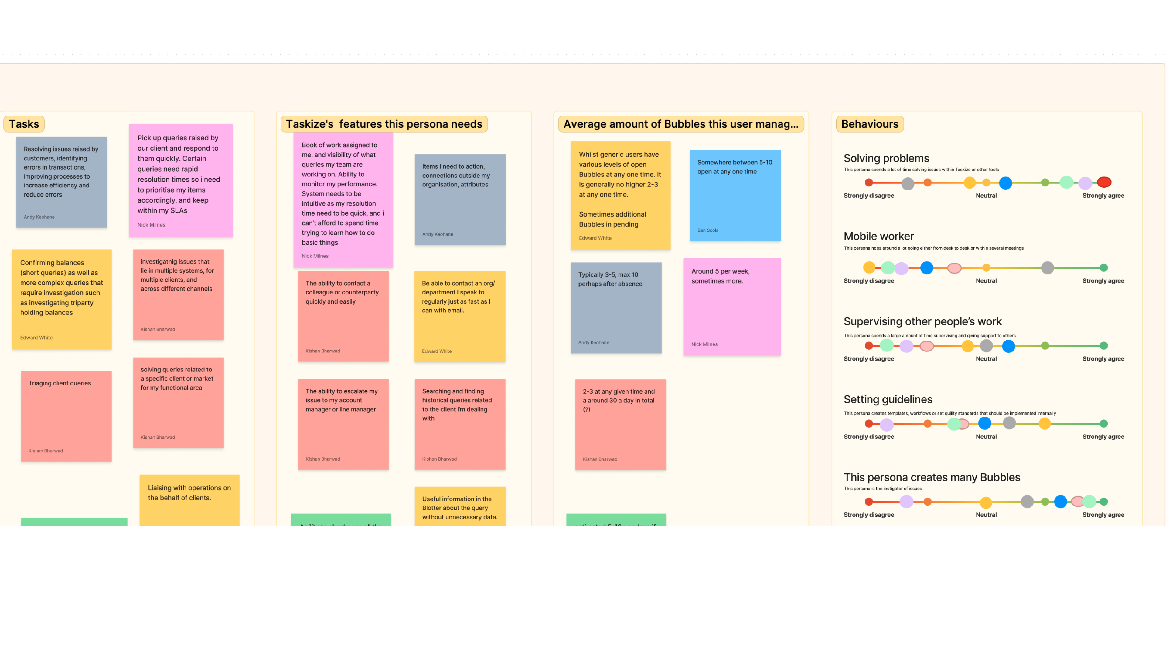
I ran a series of workshops — remote and in-person — that produced the first detailed personas and user journeys Taskize had ever had. These became the strategic reference point for the roadmap. Feature prioritisation stopped being a gut call and started being a journey-mapped one.
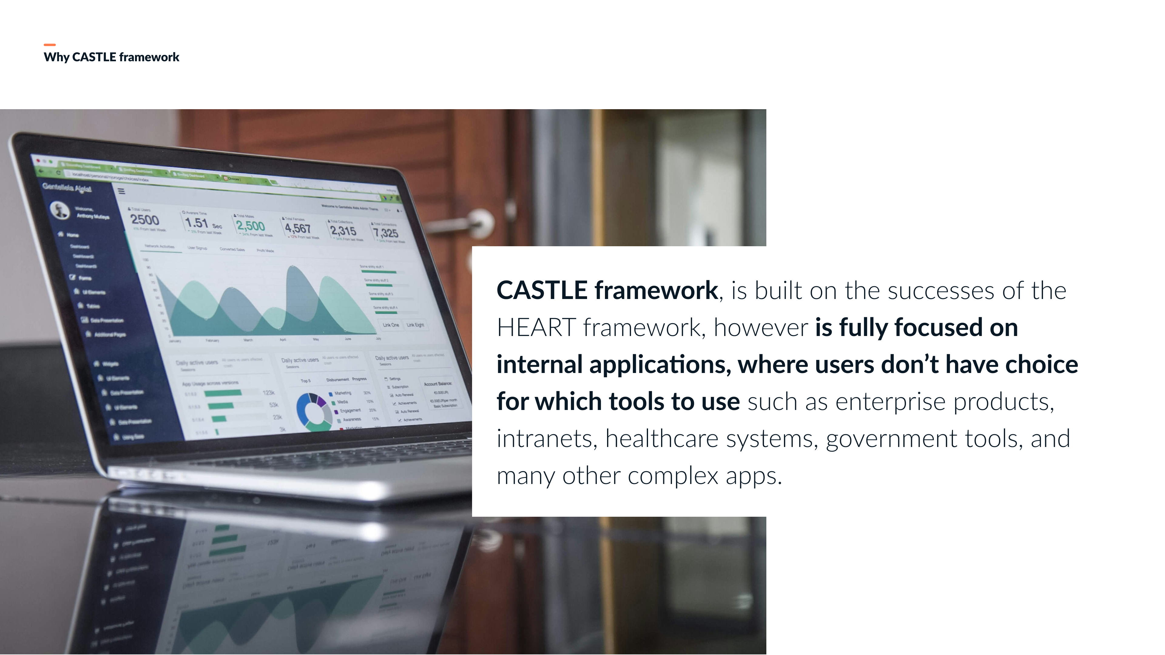
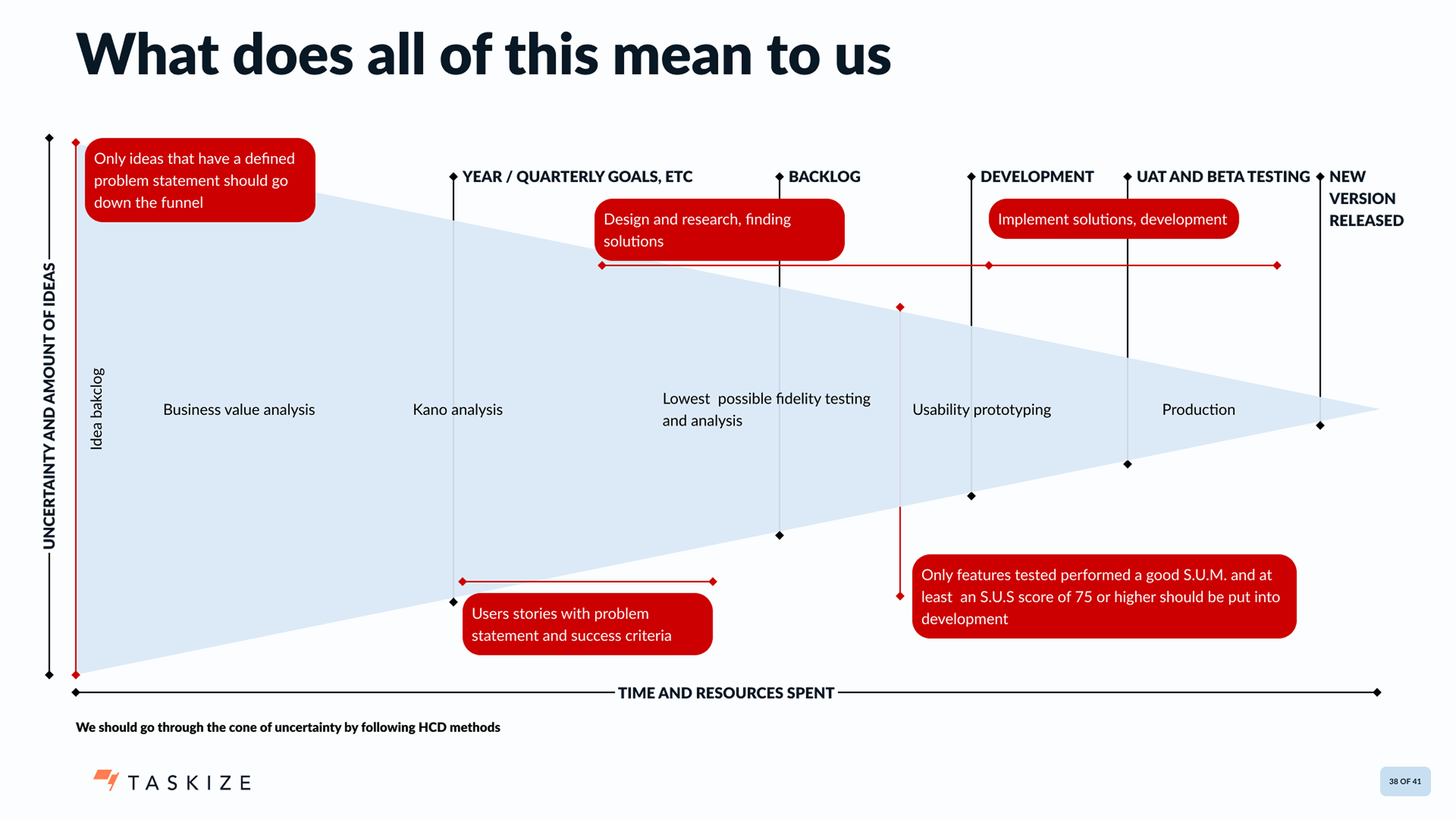
To make the new process actually hold, I introduced two measurement frameworks the team could share with engineering and leadership without losing them in jargon. CASTLE — an internal-applications framework I adapted from Google's HEART — recognises that enterprise users can't switch tools the way consumers can, which is exactly the Taskize situation. And a release funnel with explicit quality gates: every idea needs a defined problem statement before it enters the backlog; only features with a SUS score of 75 or above (and a passing S.U.M.) make it past usability prototyping into development.
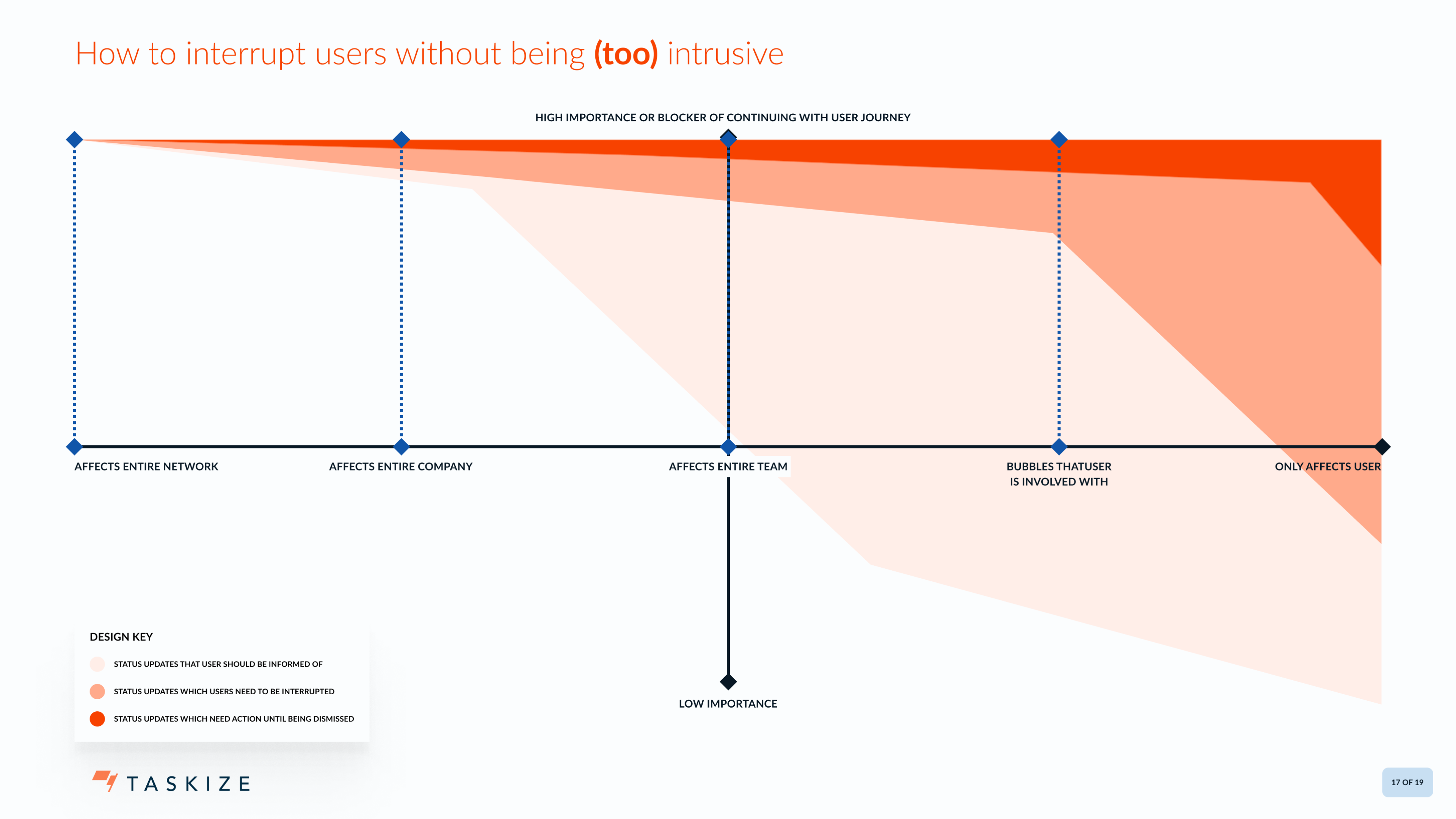
Alongside the frameworks, I introduced design patterns the team could apply consistently — most notably a model for how the product interrupts the user. Operations work is high-volume and low-tolerance for noise; getting modal vs. inline vs. ambient notification right was a recurring source of friction. I codified it.
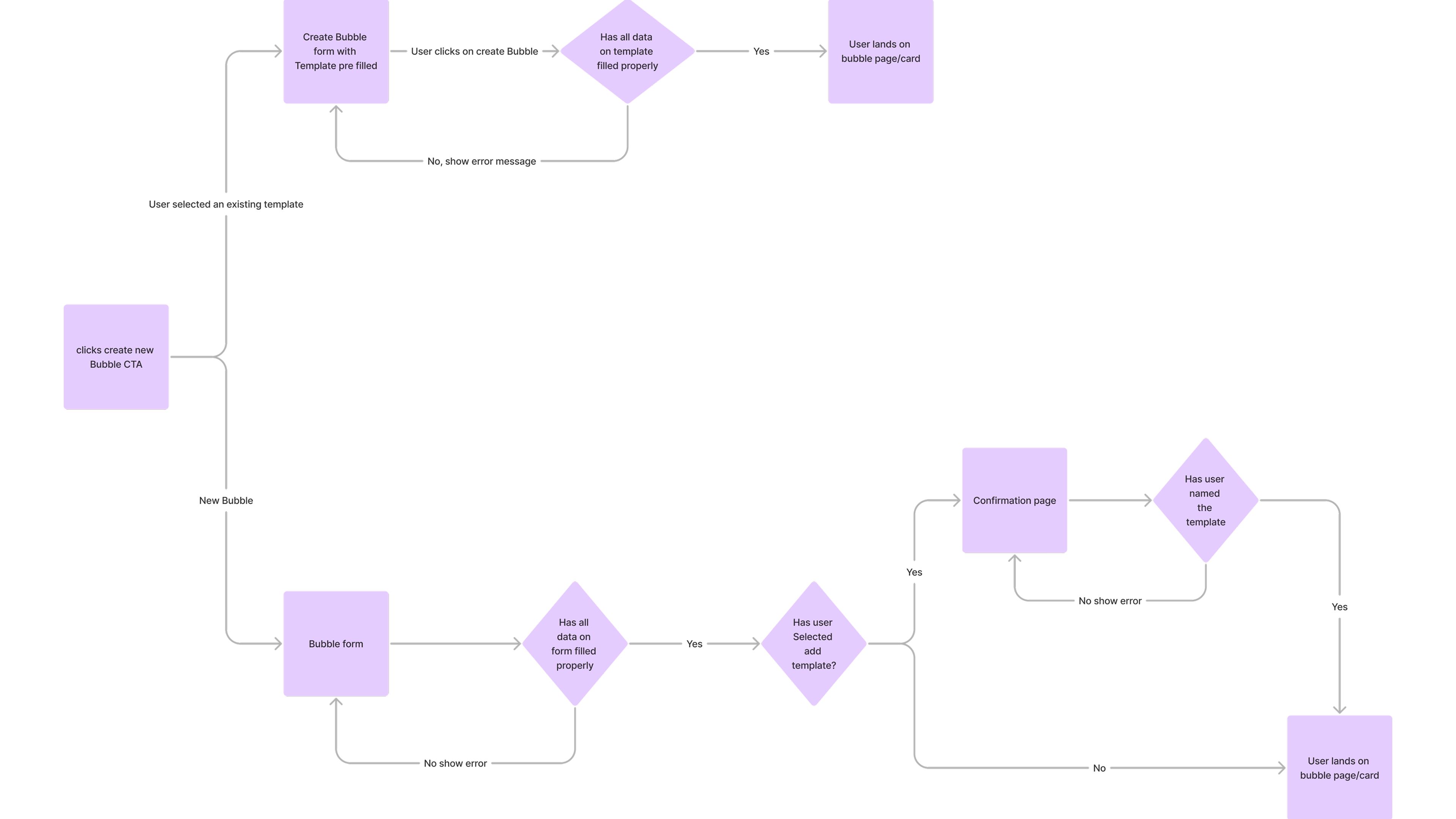
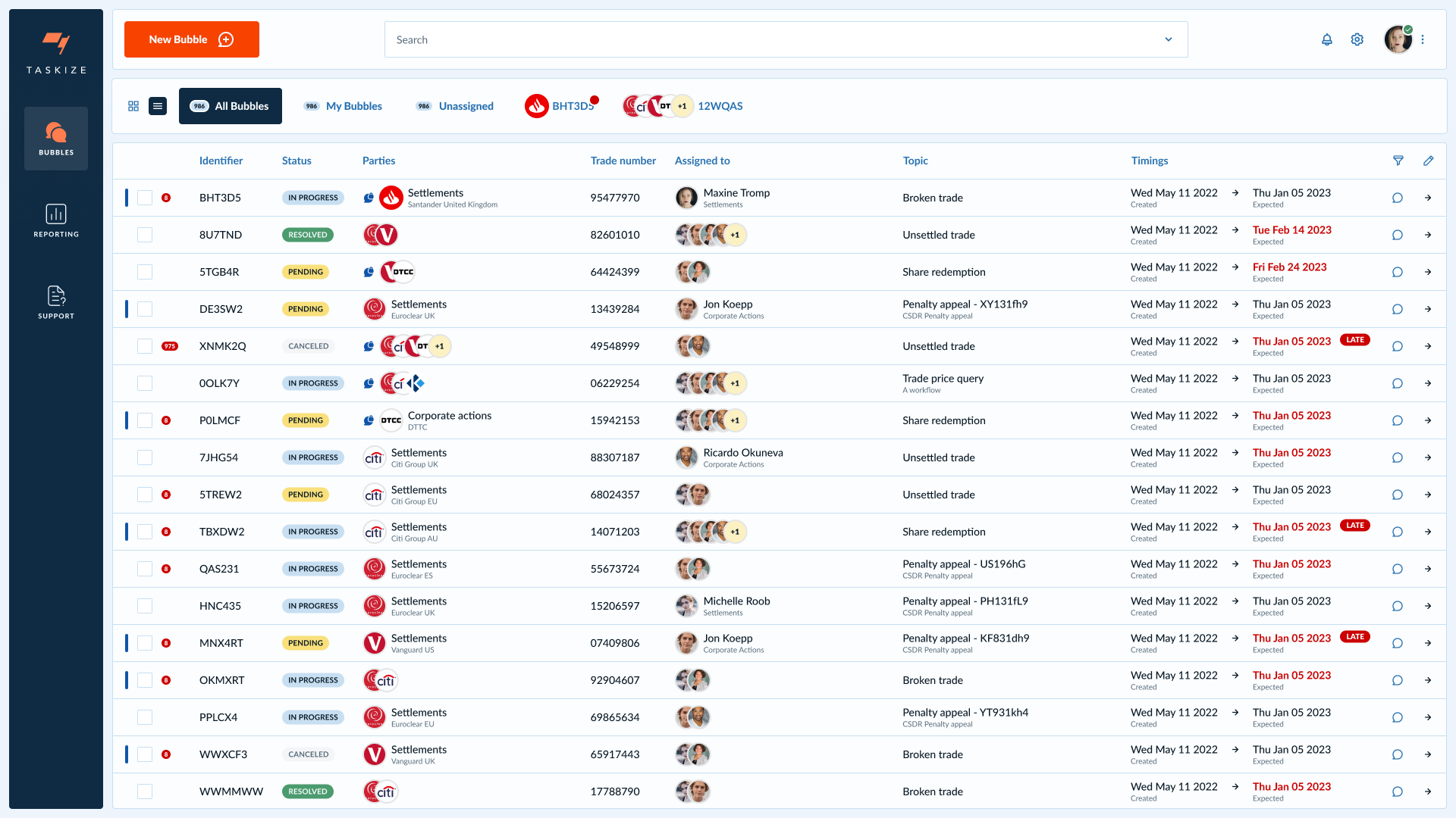
And underneath all of that — sketches, flows, the unglamorous shaping of how a single Bubble gets created, forwarded, attached to.
"When can we have this?"
Once the foundations held, I led the creation of a "concept car" prototype — a forward-looking vision of what Taskize could become, two to three years out from what was shipping.
Over three months, I took the concept on the road. I presented it to between six and ten of Taskize's most important clients, in person and remotely. The response, repeated almost verbatim across the sessions:
“When can we have this?— Roadshow · Tier-1 bank · response repeated across sessions
The business ultimately chose not to launch the full concept — a strategic pivot redirected the roadmap. But the vision had already done its work. It had proven to the clients that Taskize understood where the product needed to go, and it had given product leadership a credible artefact to argue with internally. When I shifted into delivery mode, I carried the principles from the vision into what actually shipped. And — as it turned out — I'd carry them into the strategic pivot itself.
How the work actually wanted to be organised.
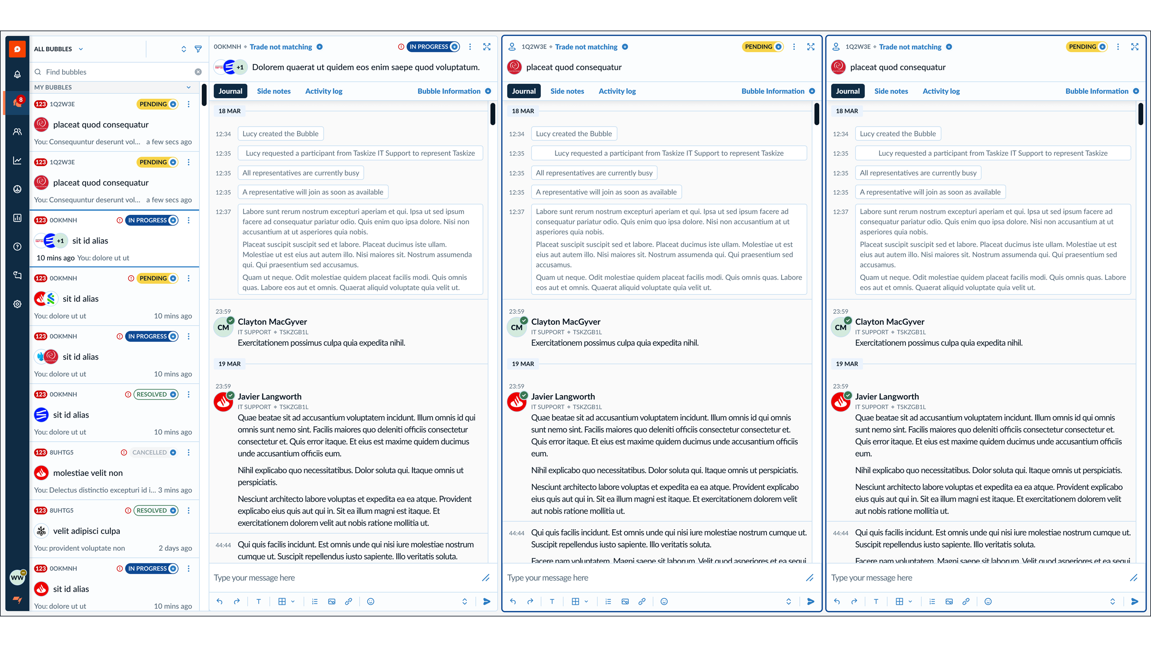
The blotter — the central work surface where post-trade operations teams spend most of their day — was the heart of the concept car. The version Taskize had shipped was a flat table that forced users to commit to one filter at a time, or to maintain clunky saved views for each scenario they cared about.
For the vision, I designed an advanced table that supported compound filtering — multiple criteria stacked and held simultaneously — so users could shift focus dynamically without losing context, and could keep the right information surfaced at any moment.
Of everything in the concept car, the blotter was what clients responded to most strongly during the roadshow. The platform's most demanding users recognised immediately that this was how their work actually wanted to be organised.
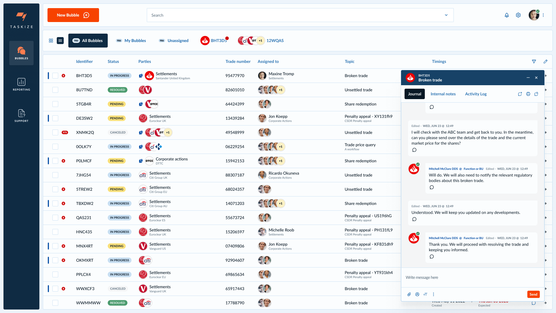
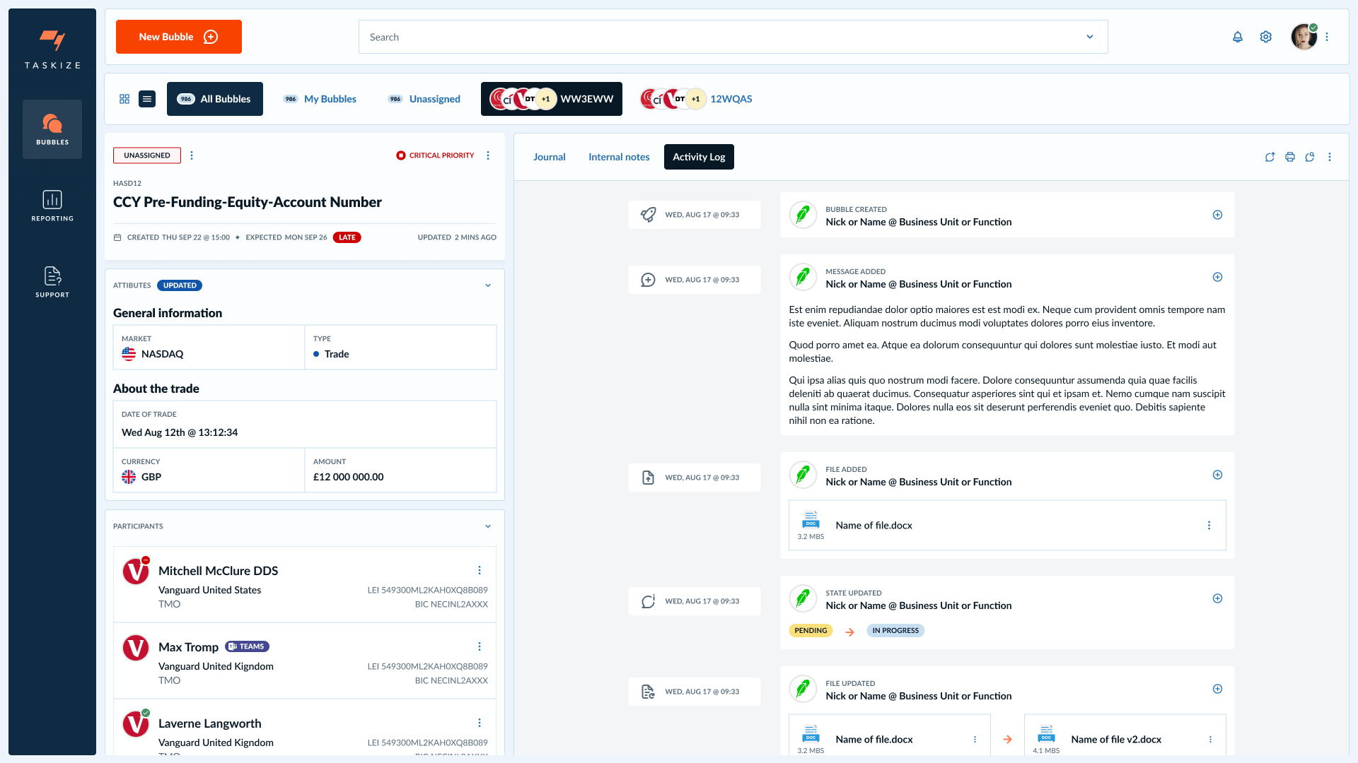
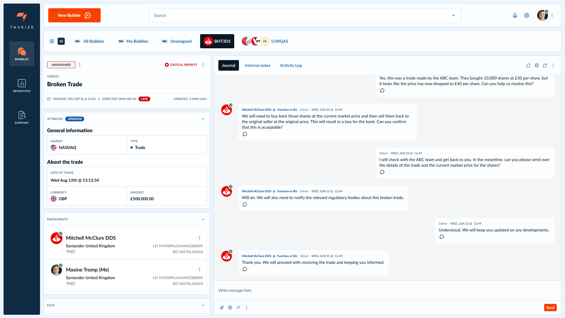
Clicking into a row was the other half of the bet. The Bubble — Taskize's atomic unit of work — needed to stop being a free-form conversation and become a structured artefact: a header with priority and lateness, a panel of typed attributes (market, instrument type, trade date, currency, amount), a participants list with counterparty affiliations, and only then the journal or activity log. Operations users had been telling us, in workshops and in the SUS comments, that they were spending more time reconstructing an exception than resolving it. Structuring the Bubble was how that stopped.
The business ultimately chose not to launch the full vision, and the blotter went with it. The design held up under exactly the audience it was built for, and that response remains, to me, one of the clearest signals I've had that a piece of work landed. And — crucially — the structure the Bubble detail proved out is the structure the Exception Monitor strategy is being built on. The pixels didn't ship; the data model did.
From values question to commercial argument.
Partway through the engagement, accessibility moved from a values question to a commercial one.
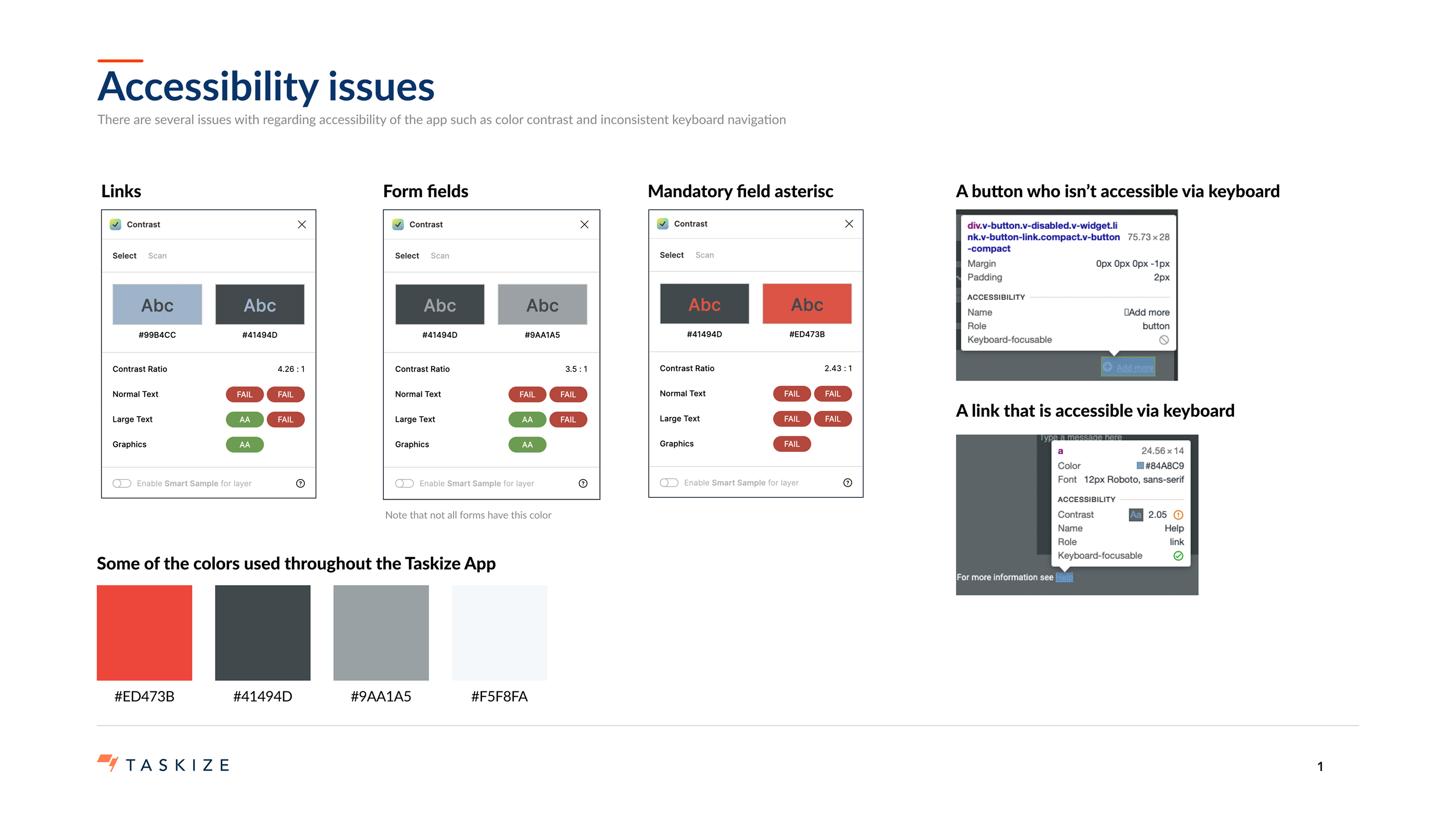
Two top-tier clients requested formal accessibility audits — driven by their own legal exposure under the Americans with Disabilities Act and the upcoming European Accessibility Act. If Taskize couldn't show credible WCAG compliance, those clients had legal cover to leave.
I led both audits. Then I brought every shipping design to AA standard for WCAG 2.1, and again for 2.2 once that became the active standard — ahead of the European Accessibility Act taking effect. The work was sustained, not symbolic. By the time the regulation landed, Taskize was already through it.
AA enforced by default, not by review.
Across the three years, a scalable design system shipped alongside the redesign work. As the design function grew and the engineering teams' velocity increased, the system became the only realistic way to keep the platform coherent.
It governed components, patterns, and accessibility behaviour. It made the AA standards enforceable by default rather than by review. And it gave the engineering teams documented patterns to build against instead of one-off specs per feature.
The vision Taskize is now building toward.
The strategic pivot that redirected the concept car wasn't a step back. It was a step into a bigger question.
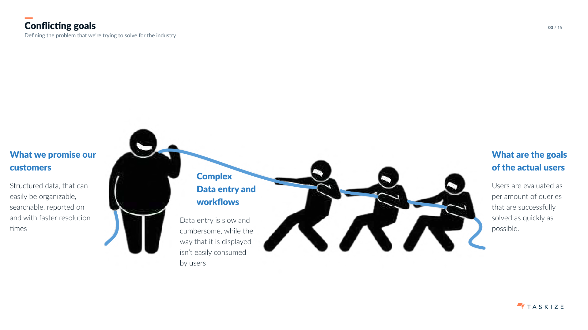
Post-trade operations teams don't actually live inside one system. They live across many — flat files, APIs, ageing internal tools — chasing exceptions wherever they surface, then trying to collaborate around them through email, chat, and Taskize Bubbles in parallel. Taskize had been sold as the place where exceptions get resolved. In practice, it was one of several places where people talked about exceptions.
Post-trade operations teams don't actually live inside one system. They live across many — flat files, APIs, ageing internal tools — chasing exceptions wherever they surface, then trying to collaborate around them through email, chat, and Taskize Bubbles in parallel. Taskize had been sold as the place where exceptions get resolved. In practice, it was one of several places where people talked about exceptions. The data, the analytics, the single source of truth Taskize promised clients on a slide — it didn't actually exist.
I led the strategy work that re-named the problem and proposed the platform that solves it: the Exception Monitor.
“What Taskize promises customers: structured data that's organisable, searchable, reportable, with faster resolution times.
What users are actually doing: slow, cumbersome data entry into a structure that doesn't match how their work flows — while being measured, by their own employers, on how quickly they resolve queries.— The conflict nobody had said out loud
The core argument is built on a mismatch I'd watched for years.
The Exception Monitor's bet is that Taskize stops being a conversation tool and becomes the aggregator — the place where exceptions from every upstream source land, get grouped, get resolved by the right counterparty, and flow back out as analytics and compliance evidence.
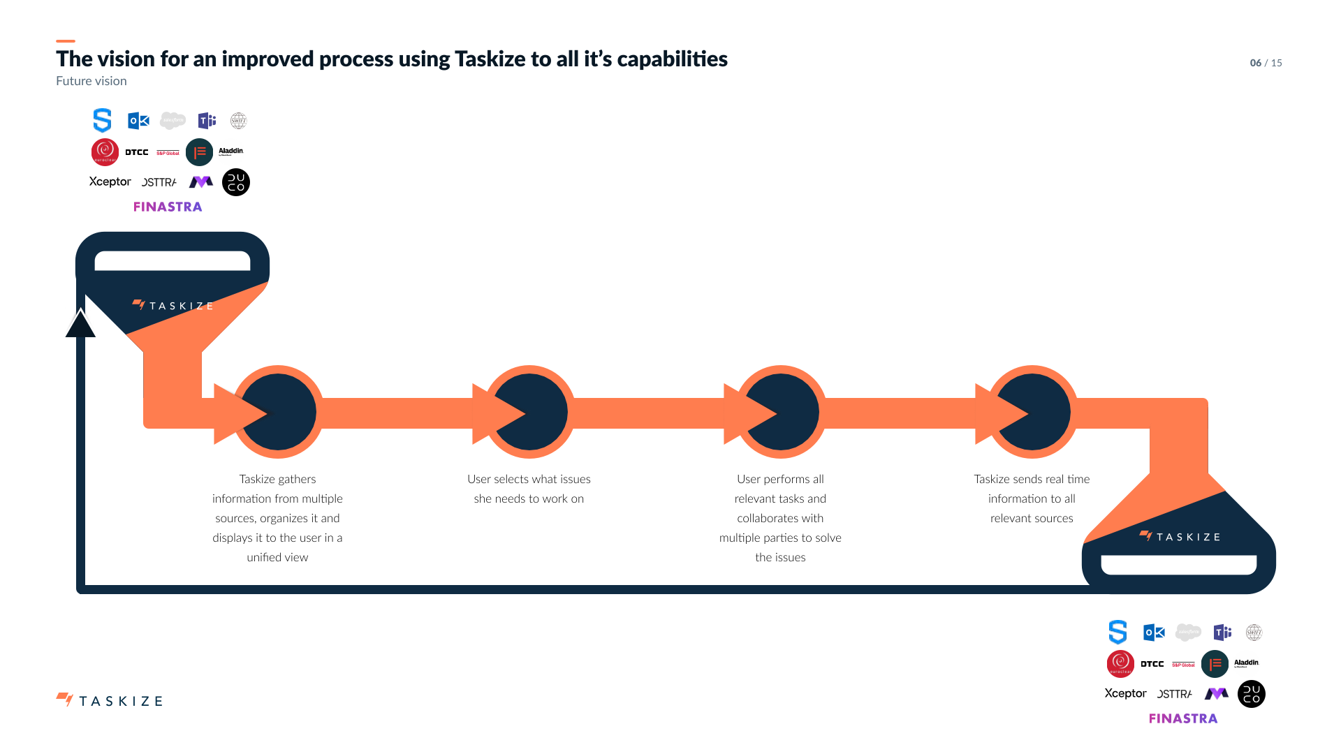
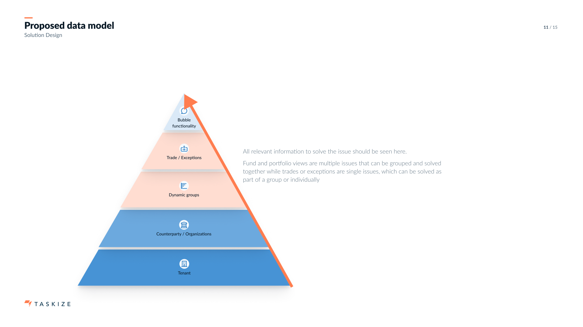
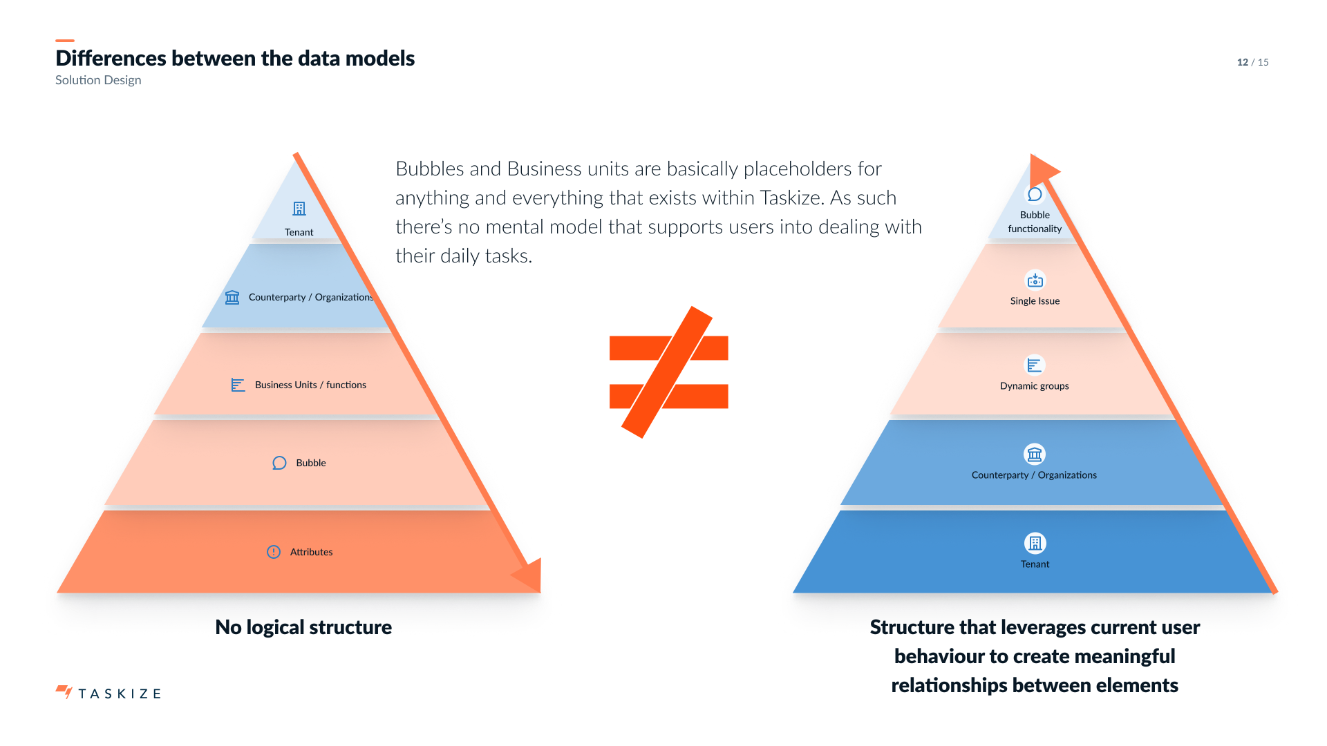
Achieving that required redesigning the data model itself. The old structure — Tenant > Counterparty > Business Units > Bubble > Attributes — was a flat hierarchy that mapped to backend plumbing, not to how operations users think. "Business units" and "Bubbles" could each mean almost anything, and attributes (the layer that would have made data usable for analytics) were almost never filled in because the cost of doing so didn't pay back to the user.
I proposed a new model that mirrors how the work actually happens: Tenant > Counterparty > Dynamic groups (portfolios, funds, batches of exceptions) > Trade / exception / request view > Bubble functionality (journal, attachments, escalations).
The strategy was adopted. The Exception Monitor is the direction Taskize is now building toward, and the design language, data model, and process I'd put in place over the previous three years are what make it executable on the timeline the business needs.
Not every piece of vision work ships as a product. Some ships as a strategy — which is what determines what every product after it gets to be.
Protect the development of independent judgment.
Throughout the engagement, I mentored the junior product designer reporting to me — through structured 1:1s, paired design work, and intentional handover of more strategic pieces as confidence grew.
The mentorship style was specific: teach the process, but protect the development of independent judgment. Albert Davis, the designer in question, later wrote:
“His mentorship style has allowed me to learn his processes and methods, but he has always placed importance on me developing my own thought patterns and deep understanding. I am genuinely grateful for the time he has invested in my growth.— Albert Davis · Product Designer, Taskize
The strategic thing is sometimes buying time.
Taskize taught me that the most strategic thing a designer can do, in a product that's already in trouble, is buy time. A six-month extension on a 12-month ultimatum was the difference between a redesign that worked and a redesign that never happened.
It also taught me the second-order version of the same lesson: once you've bought time, use some of it to argue about what the product should be, not just how it should look. The Exception Monitor only exists because the redesign earned the right for design to weigh in on strategy. Not every piece of vision work ships as a product. Some of it ships as the strategy that determines what every product after it gets to be.
What it moved.
Other work.
Let's
talk.
Curious how I can support you and your team? I'd love to hear what you're working on.